I will put all of my magazine ideas in this post, including masthead, coverlines and possible layouts / images. I will also reflect on my decisions as they evolve.
Since I've already decided on what my magazine title, font and typefaces would be on my Magazine Development Page > Magazine Development , I will now add further research and continue on making 7 thumbnail sketches.
Further Research
Typical Fashion Magazine covers :


The generic conventions of fashion magazine covers is most of the models' head / face profile are positioned in front of the name of the magazine's brand. This is because the models' prominent appearance can serve to attract attention and enhance the magazine's appeal when their faces are placed in front of the brand's name. It is also used to create emotional connection and help convey moods to the audience since the viewers are likely to engage emotionally with the cover if they find the model aspirational. Furthermore, it may be a way to harmonize the visual elements which ensures that both the model and the brand are prominent.
Fashion magazine cover, usually the ones with 'clothing' as the subgenre typically uses full body shots or shots from thighs and above to comprehensively display the clothing worn by the model as it is very crucial since the primary focus of the magazine is to showcase the latest fashion styles, trends and designs. It also shows the model's pose and body language which can help to convey a particular mood and style.


To emphasis on fashion and style, some fashion magazines like Vogue and Bazaar sometimes positioned the model further away from the camera to allow full-body shot which helps to showcase the entire outfit. It is also used to convey a specific mood or theme that complements the outfit and helps to enhance the overall visual impact of the cover. Thus, I will also try to use this idea as an inspiration for my magazine cover and compared it to the one I mentioned above to see which one is better.
Sketches
Pose Sketches


Here are the 7 sketches that I have created of the poses intended for the model during the photoshoot. Initially, I had planned to incorporate all of these poses. However, given the challenging weather conditions and the amount of people at the shooting location, I was only able to execute one pose from the sketches that is eventually selected to be used for the magazine cover (the last sketch). Nonetheless, the model also experimented with additional poses on-site, which I will showcase in the following section of this post.
Layout Sketches

Here are some sketches that I've made for the layout design of my front cover. I intend to use this as references to avoid indecisiveness and uncertainty in the decision-making process.
Front Cover Image Selection
Since I've taken a lot of pictures for the front cover, I will be selecting some of the best pictures that I've taken here.

These are the first trials of the shoot. I am not really satisfied with this shoot as the lighting in the photos turned out to be excessively dark. Although I appreciate the captured facial expression, I am concerned about the unbalanced composition due to the excessive amount of space at the top. Therefore, I decided to take some more photos because I believe that refining the lighting and balancing the composition more will contribute to a more professional result.

Here is how the second session trials turns out. This time, even though the lighting of the photos has slightly improved, it still falls short to my desired quality so I decided to address this through editing after. Despite that, the composition has significantly improved which is more important so I am quite content with the overall result. Additionally, the model stands out more prominently as she is positioned directly in the middle of the photo using an eye-level shot. I contemplated between selecting the one on the left or the middle. In the left photo, the model faces downwards, conveying a sense of mystery which makes it intriguing to the audience. It also effectively emphasizes the fashion elements which draws the attention to the outfits. However, I opted for the middle photo where the model faces directly towards the camera. This approach suggests confidence and the willingness to engage with the audience. The model's smile adds a friendly and approachable demeanor that creates a welcoming atmosphere. This aligns seamlessly with professionalism that complements the fashion style that she's wearing. Although I feel satisfied with how the photos turned out, I decided to experiment by changing the background and the model's poses to explore potential improvements.

Here are the results of the third session's trial. During this attempt, I tried to enhance visual interest by incorporating a prop, the bear doll . However, this addition imparts a cuter and more playful atmosphere which deviates from the intended vibes for my front cover. Nevertheless, this inspired the idea to use the teddy bear for the pictures for my double page spread.

This is the photo that I ended up choosing.
Editing
Enhancing the Lighting
Given my dissatisfaction with the original lighting in the photo, I endeavored to correct it by increasing the exposure and brightness. Additionally, I made adjustments factors such as contrast, highlight and shadow to achieve a more balanced composition.
I am very satisfied with the outcome as the photo is now clearer and has a higher quality, ensuring it remains sharp when viewed. Despite my initial satisfaction, I tried doing additional experimentation by applying the filter that I've made previously and typically use in Polarr to see if further improvements could be achieved.

Here is how it turned out. I think it turned out well as the lighting is subtly adjusted to create a slightly darker ambience than before. The model stands out even more prominently in the photo, adorned in white / bright-coloured clothing against a darker background. Additionally, the incorporation of hints of brown adds a touch of sophistication and class to the overall photo. Due to this, I asked a few of my friends to seek for external opinions. They all expressed a preference to this one. Therefore, I will be using this refined version for my magazine cover.
Layout Enhancements [step-by-step process]
In here, I will showcase various changes and improvements that I'll be implementing throughout the process of editing the magazine cover.
Initially, I was very confused on where to start as I was absent during the explanation, leading me to strive for perfection on the first attempt. However, I soon realized that it was impractical, as I couldn't discern which font complemented other fonts and the overall theme. This method also hindered my progress, which made me even more confused. Here is how my testing initially went :


After noting down the necessary tasks, I proceeded to further design my front cover. Here are two result drafts and one final cover that were produced following the pictures I've shared above. I will also provide annotations and reflections on areas that require improvement during the process to achieve the final look.

7th slide ) I experimented by using two colors, baby blue and dusty rose for the main cover line and cover line . However, I am uncertain if I like the result, especially considering the brown background. The combination appears somewhat peculiar to me, and there is a risk of it being confusing for readers, potentially hindering their focus on the coverline. Consequently, I have decided to not use it. Additionally, in my opinion, the text 'Exclusive Interview' for the main cover line appears too thick. I would prefer to change it to a thinner font to ensure that the model's name is highlighted more. Lastly, I think the selling line is too small, I would like to search for other fonts to replace the font that I am currently using.
8th slide) After making adjustments to the colour and fonts, I do believe that the result is better than the previous version. I also reduced the size of the barcode so it doesn't take up a lot of space. However, I still think there's a need for further refinements to improve the magazine's overall quality. Specifically, I am dissatisfied with how the cover lines overlap some parts of the model's body because it looks a little unorganized. I find the font size to be quite big. Additionally, the similarity in color between the buzzwords and the model's outfit may hinder readability when they overlap.

After adjusting the sizes of some texts, here is the updated result. However, I've started to feel that the main coverline lacks appeal since as I've mentioned in my 'Magazine Development' post > Magazine Development, I initially had two prefered main coverline ideas, and after much considerations, I decided to experiment using the second choice for my main cover. However, I am considering switching to my first choice of the main coverline idea to see if it complements the layout better.
.png)
Here are both results side by side. While both turned out well, I personally prefer the one on the right, which uses the first choice of my main coverline ideas since it appears fuller and creates a more balanced composition for the magazine cover. To gather opinions, I asked a few of my friends on which one they'd prefer and 5/6 people expressed preference for the one on the right. Therefore, I'll have decided to use it for my final magazine cover.
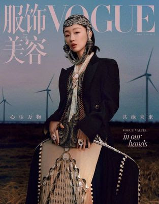
Final Draft

Here is the how it turns out. Overall, I am satisfied with it. The design turns out to be neat and elegant, and the cohesive arrangement ensures that all the elements are in place, making texts easily readable. The colour scheme complements each other well, and I am very pleased with the composition of the model in the magazine.
Final Result

Reflection : I thoroughly enjoyed this project as it allowed me to design within a genre that aligns with my interest. I had a lot of fun planning and designing the cover. The research part was also intriguing since it provides insight into the genre conventions that I choose. However, I did find the developing phase to be somewhat tiring and it isn't as interesting to me. Nonetheless, I still find this project enjoyable and I would love to do this again.
No comments:
Post a Comment