Labels

Double-Page Spread Research and Development

 I will put all of my ideas for the double-page spread in this post, including further research for what typical fashion magazine's double-page spread looks like and some sketches of potential layout designs. In here, I will also reflect on my decisions as they evolve.

Further Research
Typical Fashion Magazine double-page spread : 
After conducting more research, I discovered that, similar to contents page, the amount of photos used in the double-page spread is inconsistent. It may feature multiple photos in some instances and a single big image in others.

Multiple Images
Here are some examples of fashion magazines that incorporate multiple photos in the double-page spread. The inclusion of multiple photos reflects the flexibility and adaptability of magazines to experiment with design elements. It is often to create a visually engaging and compelling layout that enhances the reader's experience. Moreover, it allows for visual diversity by showing different aspects of a theme. Some magazines also tend to overlap images. When it's done well, this technique can enhance the reading experience by creating a seamless visual flow.

Single Image
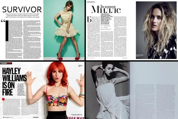
Here is what a double-page spread would look like if it only incorporates a single large image. This creates a powerful focal point, drawing immediate attention to the photo and making a strong visual point. It also provides the opportunity to highlight complex details of designs, resulting in a cleaner and streamlined layout. This simplicity allows for a more straightforward and elegant design, making the content easier to read. 

Collage
Fashion magazines also use collage-style layouts in their double-page spreads. This is because collages can create visually stimulating composition that can help to attract readers' attention. It also conveys a sense of movement and enable the magazine to tell a visual story by combining photos of the fashion elements. Additionally, it also engage readers by encouraging them to explore the details within the page. 

Although each layout idea has its own uniqueness, I've decided to choose the first idea, which involves incorporating multiple images in the double-page spread. I choose this because I believe it will be more engaging for readers and the design isn't overly complicated. Furthermore, It also allows for visual narrative, making it more interesting to look at. 

Layout Sketches

Double-Page Spread Image selection
I've taken quite a lot of pictures for my double-page spread. Therefore, I've attempted to select and showcase the ones I like the most-, those that I would potentially use in my double-page spread.

Main Image Choices

These are some of my favorite pictures that were taken for the double page spread. I really like how they turned out since it has variety of poses and facial expressions in each photo. Although some of the pictures may turned out quite dark, I'm sure that this can be fixed during the editing process. Therefore, I am highly satisfied with how the result of these photos turned out.


Here is my final selection for the main image in the double-page spread. Somehow, during the process of selecting the main image was rather straightforward for me. Upon reviewing the results, I quickly discerned that this particular photo stood out to me the most. due to it undeniable visual appeal that resonates strongly with my preference. I really like how the model poses because it creates an adorable interaction between the model and the teddy bear. The model's facial expression is also on point, with a cute smile conveying a sense of sweetness and evoking warm and endearing feelings that match the magazine's theme and vibes. Additionally, it gives off a youthful and lively energy that resonates with the target audience of this magazine. Furthermore, I'm really glad that I decided to incorporate the teddy bear in the shoot since it adds a sentimental touch to the photo, evoking feelings of nostalgia, evoking a sense of carefree happiness that align with the style of the outfit.


Sub-images Choices


After taking the main photo, we decided to take additional photos to complement the main image in hopes to minimize negative space in the double-page spread layout. The photos above represents some of the best results that I am inclined to consider for inclusion on the page. I experimented with various angles and lighting, emphasizing on the key elements of the photos such as rings, eyes and necklace using close-up shots. I am pleased with the outcome of these photos. Although I now find myself in a dilemma as I struggle to determine which one I prefer.


After much consideration, I have selected these photos for the sub-images in my double page spread. I chose them based on advantageous of the lighting and composition. The image featuring the teddy bear highlights the model's ring, while the upper right emphasizes the necklace, and the lower right focuses on the eyes. I believe these photos will harmonize and complement the main image effectively.

Editing
Enhancing the Lighting
Even though I like how the pictures turned out, I am not entirely satisfied with the lighting as it appears a little too dark. Therefore, I will attempt to enhance the brightness of the selected photos and make some more colour adjustments to achieve a more balanced appearance. I will showcase the edited results here. 


To enhance the lighting, I started the editing process by brightening up the photos and making tone adjustments, such as modifying exposure, contrast, highlights, and shadows to achieve colour balance. After that, I applied the brown-coloured filter that I created in Polarr, the same one used for both my front cover and contents page photos. This choice was intentional since I want to the overall contrast in this photo to create more depths and dimension. Therefore, I adjusted the brightness of the photo beforehand, ensuring that when I apply the brown filter, the result of the photos wouldn't be too dark.


The process of editing this photo differs slightly from the other photos shown above. Initially, I followed the same editing steps as the rest of the photos. However, when I applied the brown filter to this photo, It appeared a little too dark for my liking. Since I am concerned that it might not align with the vibes of other photos, I decided to add an additional step- brightening up the photo once again. To achieve this result, I increased the exposure by 14, brightness by 4 and added contrast by 24. Overall, I'm satisfied with the outcome as the photo glows more and exudes a more attractive appeal for the readers.

Layout Sketches 
Here, I will showcase three of my main layout ideas through some sketches that I've made to make my work less confusing and more manageable. I will develop them further using canva to see how it will turn out in the end.


Initially, I only intended to only develop two of my sketches, specifically the ones that incorporate sub images. However, after further research into various magazine double-page spreads within this genre, I became increasingly intrigued by layouts that only features a single image. Therefore, I decided to create a sketch and develop the concept that focuses on a single image as well.

Layout Enhancements [step-by-step process]
I will show the process of finalizing and achieving the desired outcome my double-page spread in this section. Additionally, I will provide annotations and notes to highlight areas for improvement as I made progress through the process.


Final Draft

Here is what I ended up choosing for the final layout of my magazine's double-page spread. I opted for this layout because it appears fuller, and the sub images enhances the page's overall appeal. It also effectively minimizes negative space, introduces more colours to the page, and adds visual interest for the audience. Although I like my third idea, the one with a single main image, I decided not to use it because I think that it is too basic, resembling many existing magazine articles. Additionally, all the article texts were confined to one page, potentially making it challenging for readers to read and appearing overwhelming. Furthermore, it may also be perceived as 'too much texts' to others that it might become uninteresting for them to read. Therefore, I decided to use this layout instead.

Final Result

After discussing with my teacher, he provided me with some suggestions to enhance my work. I decided to add pink on the title to accentuate it so that it will immediately catch the audiences' attention. Furthermore, since pink is often being connoted as feminine, it suits the target audience demographic as it is mainly targeted towards female. Another adjustment I've made is to ensure consistent width alignment for all text paragraphs, enhancing overall neatness and organization. Additionally, I've cropped the image of the model's eye to achieve a closer shot, enabling greater detail capture. Furthermore, I've incorporated captions for each picture in the double-page spread as I forgot to add it beforehand. I appreciate the feedbacks as this result appears more visually appealing and captivating. Therefore, I decided to choose this as the final result for my double-page spread.

Reflection : Creating the double-page spread was the most challenging task among the three (main cover, contents page and double-page spread). This one took me the longest as it requires meticulous attention to details, ensuring equal sizing on both pages, adjusting font size in each paragraphs and arranging photos systematically. Furthermore, balancing the composition was challenging, given some parts of the texts appear to have different amount of sentences. Despite feeling overwhelmed at times, I am really satisfied with the outcome as it turned out better than what I had expected.

Contents Page Research and Development

 I will put all of my ideas for the content's page in this post, including possible layouts and images that I'll be choosing from. In here, I will also reflect on my decisions as they evolve.

Further Research
Typical Fashion Magazine contents page :


After researching the contents pages of some fashion magazines, I've discovered that the amount of pictures used in the contents page are usually inconsistent. Fashion magazine typically place a high value on visual appeal and creativity in their design since they help to establish a strong brand identity to entice readers to explore the content. It also aligns with the creative and artistic vibe of the fashion industry. Therefore, the amount of pictures that are used varies, depending on the magazine’s theme, target audience and the editorial team's creative direction for what they believe would work best for the issue.

The first image is from the Cosmopolitan x NOW TV magazine that was released back in December 2019. By incorporating multiple photos on the contents page, it enhances visual interest, making it more appealing. Additionally, it serves as a preview of the content within the magazine and enables the showcasing of content diversity in a concise form. However, there may be a risk of visual overload, potentially resulting in a cluttered and busy appearance on the contents page. This makes it challenging for readers to quickly and easily identify the contents they are interested in.

The second to fourth images are examples of fashion magazines that only incorporate one image on the contents page. By only incorporating a single large image, it creates a sense of elegance and simplicity since it allows for a clean and uncluttered design. This method not only makes a strong visual statement but also immediately captures the readers attention, setting the tone for the entire magazine. Additionally, it can serve as a visual representation of the main feature which attracts readers to delve into the content related with that image. However, it may offer only a limited preview of diverse content inside the magazine, reduces its informational value and increasing the risk of the contents page appearing monotonous or repetitive. 

I have also observed that majority of fashion magazines typically feature images of the model(s) and typically comprise approximately 100+ pages. The magazine names are usually positioned at the top in a large and bold font size to ensure easy recognition by readers.

Both have their pros and cons. Nonetheless, I have decided to opt for the one featuring only a single main image in the magazine as I aim for a design that exudes elegance and simplicity aligning seamlessly with the theme of my magazine. However, I will still try to experiment by using two or three images to see if it fits better.

Contents Page Image Selection


In the middle of the shoot, I decided to take pictures of the model's face expression to assess which ones best aligned with the mood of the magazine. The photos shown above are the results of this decision. I ended up loving how these photos turned out, leading me to choose them for the image in my contents page. I used eye-level close up shots of the model's face to establish a direct connection between the model and readers. Not only does it make it easier to highlight facial expressions, it also proves effectiveness in conveying specific emotions that the model aims to address.


Among all the pictures, I believe this one will better suit the image for my contents page better because it conveys a sense of simplicity and elegance. I like how gentle her facial expressions are and the elegant smile that exudes sophistication and refinements. This creates an approachable demeanor and fosters emotional connections which allows readers to feel a greater sense of relatability. 


After choosing the photo that I'll be using in the page, I decided to change the image colour by applying the same filter used for my front cover design that I've made using Polarr. I applied this filter to achieve a balanced colour palette that complement other colours present in the photo as well, in a harmonious and visually pleasing result. Furthermore, I believe that the filter significantly enhances the overall contrast in the photo which helps to create more depths and dimensions.

Layout Sketches


Here are four layout sketches that I've made for my contents page. Initially, I intended to select two main layouts for me to develop further. However, I am curious on how all of it will look like in the end. Therefore, I have decided to experiment and develop all four layouts using canva. Furthermore, I had an idea of incorporating a cut-out image of my doll in some of the contents page, as I believe it may align well with the theme. Additionally, in the fourth sketch, I integrated two different images, each featuring distinct facial expressions because I am curious about the outcome and how it will contribute to the overall aesthetic.


(This is the image that I took of my doll which I believe would be a great fit for the contents page)

Editing
Layout Enhancement and Processes
Here is the development of all my layout sketches that I've created. I used canva to finalize the look of my contents page. I will be annotating areas for improvements as I progress through the process. 


Final Result

This is the final result of my magazine's contents page. I prefer this design the most because it exhibits a balanced composition and it a neater overall look compared to the other designs I've created. I also asked a few of my friends' opinions on which one they'd prefer and majority opted for this option. Hence, I choose this for my final contents page design.


Reflection : Honestly, I find creating the contents page somehow more challenging than designing the front cover. In my opinion, balancing simplicity and visual interest is tricky, as making it too simple can be uninteresting, while excessive complexity can make it too cluttered and readers might find it hard to read. I find it hard to balance the composition and many attempts left me dissatisfied. Nevertheless, I am satisfied with the final contents page result, acknowledging that there are areas for improvement. I will learn from this and hopefully create a better one in the future. 


Front Cover Research and Development

I will put all of my magazine ideas in this post, including masthead, coverlines and possible layouts / images. I will also reflect on my decisions as they evolve.

Since I've already decided on what my magazine title, font and typefaces would be on my Magazine Development Page > Magazine Development , I will now add further research and continue on making 7 thumbnail sketches.

Further Research
Typical Fashion Magazine covers :


The generic conventions of fashion magazine covers is most of the models' head / face profile are positioned in front of the name of the magazine's brand. This is because the models' prominent appearance can serve to attract attention and enhance the magazine's appeal when their faces are placed in front of the brand's name. It is also used to create emotional connection and help convey moods to the audience since the viewers are likely to engage emotionally with the cover if they find the model aspirational. Furthermore, it may be a way to harmonize the visual elements which ensures that both the model and the brand are prominent. 

Fashion magazine cover, usually the ones with 'clothing' as the subgenre typically uses full body shots or shots from thighs and above to comprehensively display the clothing worn by the model as it is very crucial since the primary focus of the magazine is to showcase the latest fashion styles, trends and designs. It also shows the model's pose and body language which can help to convey a particular mood and style. 

Therefore, I want to use this as an inspiration for my fashion magazine cover as it has an aesthetic and well-balanced composition that will help my front cover design look visually pleasing.


To emphasis on fashion and style, some fashion magazines like Vogue and Bazaar sometimes positioned the model further away from the camera to allow full-body shot which helps to showcase the entire outfit. It is also used to convey a specific mood or theme that complements the outfit and helps to enhance the overall visual impact of the cover. Thus, I will also try to use this idea as an inspiration for my magazine cover and compared it to the one I mentioned above to see which one is better.

Sketches
Pose Sketches


Here are the 7 sketches that I have created of the poses intended for the model during the photoshoot. Initially, I had planned to incorporate all of these poses. However, given the challenging weather conditions and the amount of people at the shooting location, I was only able to execute one pose from the sketches that is eventually selected to be used for the magazine cover (the last sketch). Nonetheless, the model also experimented with additional poses on-site, which I will showcase in the following section of this post.

Layout Sketches 


Here are some sketches that I've made for the layout design of my front cover. I intend to use this as references to avoid indecisiveness and uncertainty in the decision-making process.

Front Cover Image Selection
Since I've taken a lot of pictures for the front cover, I will be selecting some of the best pictures that I've taken here. 

These are the first trials of the shoot. I am not really satisfied with this shoot as the lighting in the photos turned out to be excessively dark. Although I appreciate the captured facial expression, I am concerned about the unbalanced composition due to the excessive amount of space at the top. Therefore, I decided to take some more photos because I believe that refining the lighting and balancing the composition more will contribute to a more professional result.

Here is how the second session trials turns out. This time, even though the lighting of the photos has slightly improved, it still falls short to my desired quality so I decided to address this through editing after. Despite that, the composition has significantly improved which is more important so I am quite content with the overall result. Additionally, the model stands out more prominently as she is positioned directly in the middle of the photo using an eye-level shot. I contemplated between selecting the one on the left or the middle. In the left photo, the model faces downwards, conveying a sense of mystery which makes it intriguing to the audience. It also effectively emphasizes the fashion elements which draws the attention to the outfits. However, I opted for the middle photo where the model faces directly towards the camera. This approach suggests confidence and the willingness to engage with the audience. The model's smile adds a friendly and approachable demeanor that creates a welcoming atmosphere. This aligns seamlessly with professionalism that complements the fashion style that she's wearing. Although I feel satisfied with how the photos turned out, I decided to experiment by changing the background and the model's poses to explore potential improvements.

Here are the results of the third session's trial. During this attempt, I tried to enhance visual interest by incorporating a prop, the bear doll . However, this addition imparts a cuter and more playful atmosphere which deviates from the intended vibes for my front cover. Nevertheless, this inspired the idea to use the teddy bear for the pictures for my double page spread.


This is the photo that I ended up choosing.

Editing
Enhancing the Lighting
Given my dissatisfaction with the original lighting in the photo, I endeavored to correct it by increasing the exposure and brightness. Additionally, I made adjustments factors such as contrast, highlight and shadow to achieve a more balanced composition.


I am very satisfied with the outcome as the photo is now clearer and has a higher quality, ensuring it remains sharp when viewed. Despite my initial satisfaction, I tried doing additional experimentation by applying the filter that I've made previously and typically use in Polarr to see if further improvements could be achieved. 


Here is how it turned out. I think it turned out well as the lighting is subtly adjusted to create a slightly darker ambience than before. The model stands out even more prominently in the photo, adorned in white / bright-coloured clothing against a darker background. Additionally, the incorporation of hints of brown adds a touch of sophistication and class to the overall photo. Due to this, I asked a few of my friends to seek for external opinions. They all expressed a preference to this one. Therefore, I will be using this refined version for my magazine cover.

Layout Enhancements [step-by-step process]
In here, I will showcase various changes and improvements that I'll be implementing throughout the process of editing the magazine cover. 

Initially, I was very confused on where to start as I was absent during the explanation, leading me to strive for perfection on the first attempt. However, I soon realized that it was impractical, as I couldn't discern which font complemented other fonts and the overall theme. This method also hindered my progress, which made me even more confused. Here is how my testing initially went :


After noting down the necessary tasks,  I proceeded to further design my front cover. Here are two result drafts and one final cover that were produced following the pictures I've shared above. I will also provide annotations and reflections on areas that require improvement during the process to achieve the final look.


7th slide ) I experimented by using two colors, baby blue and dusty rose for the main cover line and cover line . However, I am uncertain if I like the result, especially considering the brown background. The combination appears somewhat peculiar to me, and there is a risk of it being confusing for readers, potentially hindering their focus on the coverline. Consequently, I have decided to not use it. Additionally, in my opinion, the text 'Exclusive Interview' for the main cover line appears too thick. I would prefer to change it to a thinner font to ensure that the model's name is highlighted more. Lastly, I think the selling line is too small, I would like to search for other fonts to replace the font that I am currently using.

8th slide) After making adjustments to the colour and fonts, I do believe that the result is better than the previous version. I also reduced the size of the barcode so it doesn't take up a lot of space. However, I still think there's a need for further refinements to improve the magazine's overall quality. Specifically, I am dissatisfied with how the cover lines overlap some parts of the model's body because it looks a little unorganized. I find the font size to be quite big. Additionally, the similarity in color between the buzzwords and the model's outfit may hinder readability when they overlap.


After adjusting the sizes of some texts, here is the updated result. However, I've started to feel that the main coverline lacks appeal since as I've mentioned in my 'Magazine Development' post > Magazine Development, I initially had two prefered main coverline ideas, and after much considerations, I decided to experiment using the second choice for my main cover. However, I am considering switching to my first choice of the main coverline idea to see if it complements the layout better.


Here are both results side by side. While both turned out well, I personally prefer the one on the right, which uses the first choice of my main coverline ideas since it appears fuller and creates a more balanced composition for the magazine cover. To gather opinions, I asked a few of my friends on which one they'd prefer and 5/6 people expressed preference for the one on the right. Therefore, I'll have decided to use it for my final magazine cover.

Final Draft

Here is the how it turns out. Overall, I am satisfied with it. The design turns out to be neat and elegant, and the cohesive arrangement ensures that all the elements are in place, making texts easily readable. The colour scheme complements each other well, and I am very pleased with the composition of the model in the magazine.

Final Result

Despite already being satisfied with my initial design, there are still some areas that requires improvement. Therefore, after receiving some feedbacks from my teacher and friends, I've made several adjustments to the cover. Firstly, I decided to standardized the letter 'J' at 'Jmin's Fashion Tips' to match the rest of the letters, ensuring a more balanced and consistent appearance. Following this, I increased the font size of the text 'イガリファッション' to create a fuller and more impactful cover. Additionally, I enlarged the barcode and price, and included a text below indicating 'scan to read online'. This addition aims to facilitate easier scanning for the audience and inform them about the magazine's online presence which provides an alternative accessible platform for content consumption.

Reflection : I thoroughly enjoyed this project as it allowed me to design within a genre that aligns with my interest. I had a lot of fun planning and designing the cover. The research part was also intriguing since it provides insight into the genre conventions that I choose. However, I did find the developing phase to be somewhat tiring and it isn't as interesting to me. Nonetheless, I still find this project enjoyable and I would love to do this again.