Indie-pop Album Conventions
Front Cover
Artist name
Album name
Often mixed media between ‘cartoon’ and ‘real life’ and contains doodles/patch work
Grainy texture
Often gives off vintage and/or nostalgic vibes
Has soft, muted colors
Back Cover
Tracklist
Vintage fonts/handwritten
Color scheme and image/drawings included match the front cover
Production company credit
Barcode
Inside/Content
Plastic tray/cardboard slot that holds CD
Color scheme and illustrations match both front and back cover
Lyrics/thank-you note
Handwritten style fonts
After doing research on the typical conventions of pop music albums, I looked deeper into several different albums to help me create a digipak for our music video album.
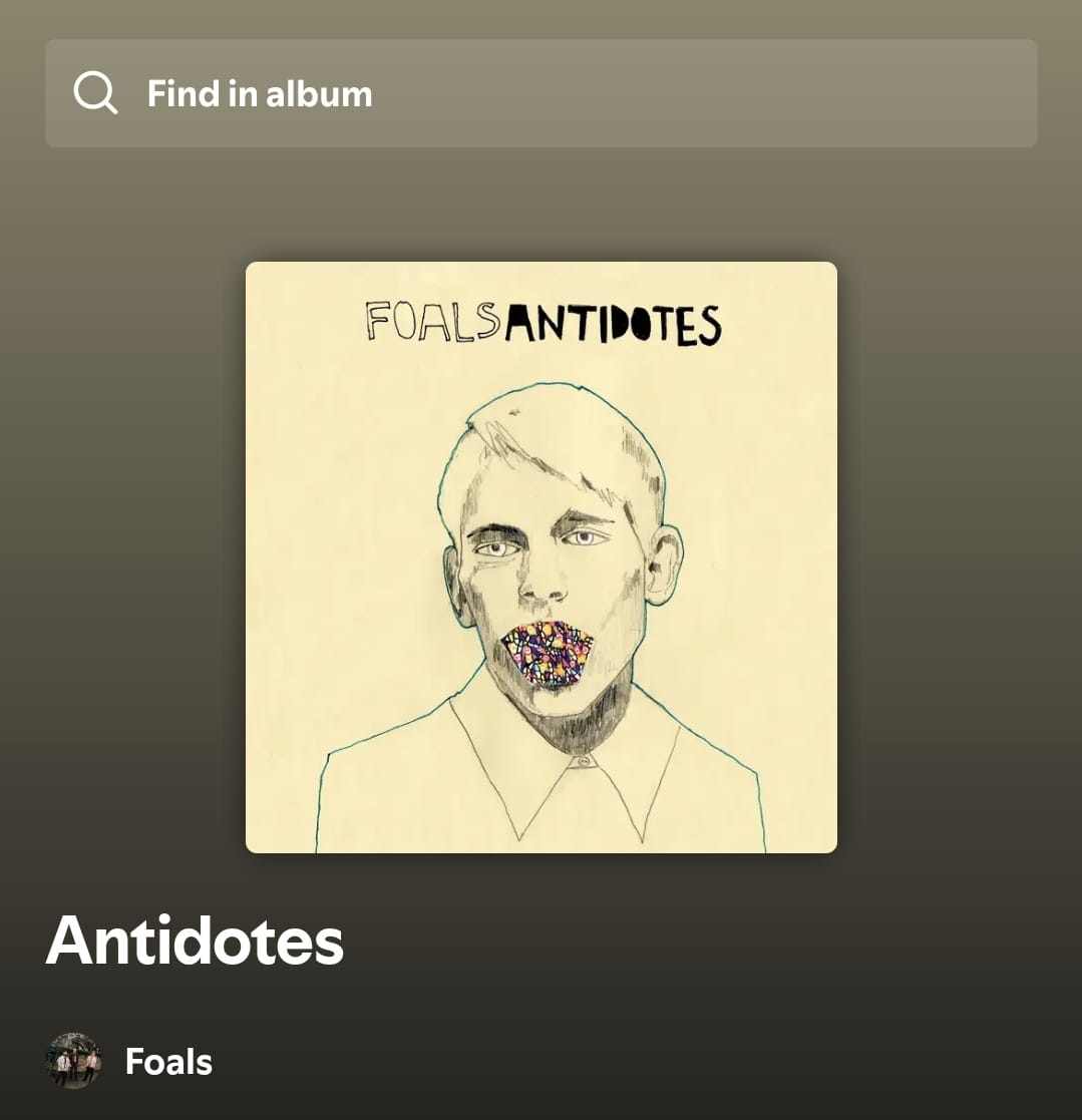
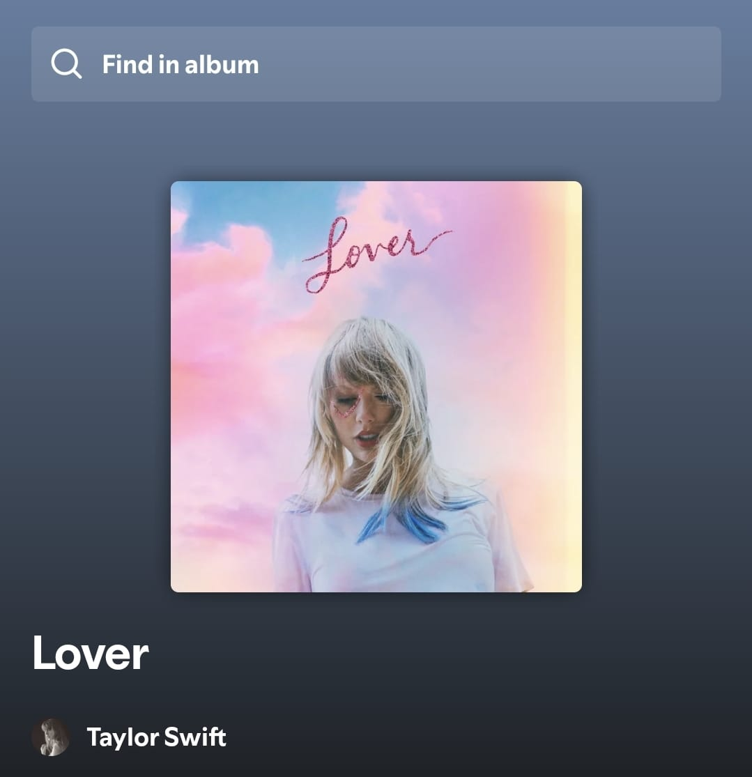
Beabadoobee - Beatopia
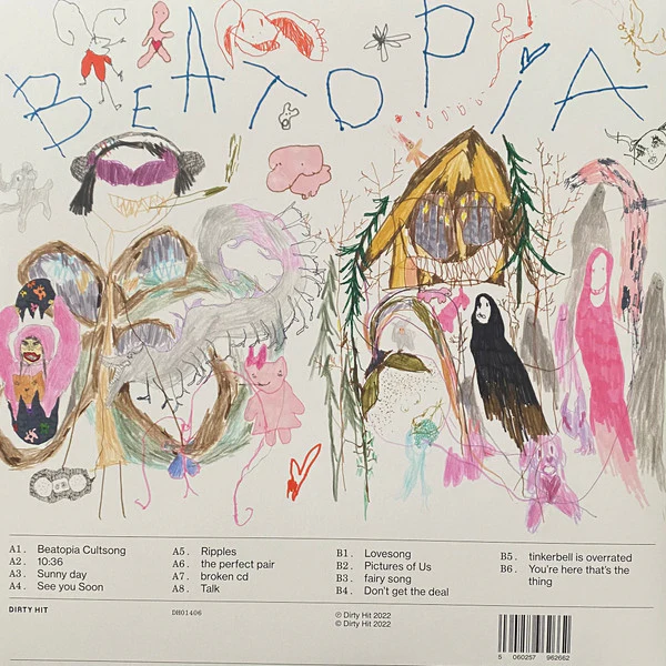
As seen in most indie-pop album covers, the Beatopia album conveys a deep meaning which Beabadoobee explains to be an imaginary dreamland that she had in her childhood. I really like the pastel colors used on this album cover and the rather messy and child-like doodles effectively convey the meaning that Beabadoobee wants the audience to feel. It gives off a very nostalgic and whimsical feel. Her album subverts some of the conventions for indie-pop album covers such as the presence of the artist’s name and album title. This causes the audience’s focus to be directed to only the artwork, standing on its own, making it feel like a visual storytelling rather than just an album cover.
The back cover suits the indie-pop genre as it matches the front cover , has a tracklist, and includes a barcode for consumers/audience to scan. She puts the album title on the back cover instead of the front cover, which subverts the typical conventions of indie-pop album covers. Moreover, she also subverts this convention by using handwritten, kind of scribbled font, unlike how indie-pop album covers usually use clean.
The CD cover for the Beatopia album, in my opinion, doesn’t really match in terms of color with the front and back cover. I will keep in mind not to do this for our music video’s CD cover.
Although Beabadoobee doesn’t have a fixed logo, she still shows her branding effectively as the early y2k nostalgia as well as a soft but rebellious girl. She often uses handwritten fonts and scrapbook visuals on her albums and products, therefore why I stated that the Beatopia album conveys her branding effectively. At first glance, the Beatopia album may not look ‘rebellious’, especially due to the pastel colours used, but if closer attention is given, there are subtle features in the doodles such as monsters and cigarettes which conforms to Beabadoobee’s star persona of being rebellious yet soft. Moreover, the album doesn’t involve any camera work as it is just doodles.
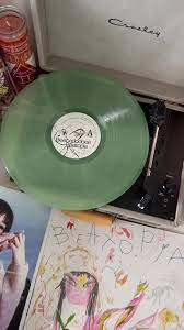
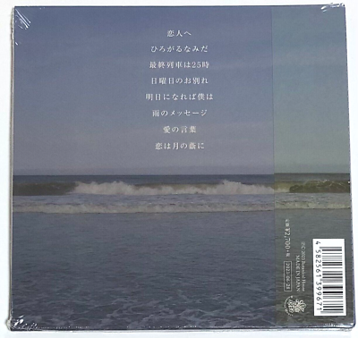
Lykke Li - Youth Novels
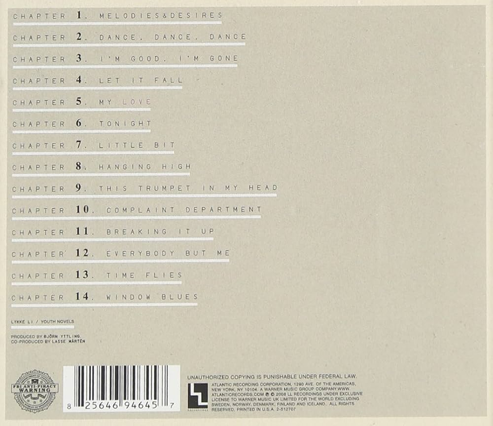
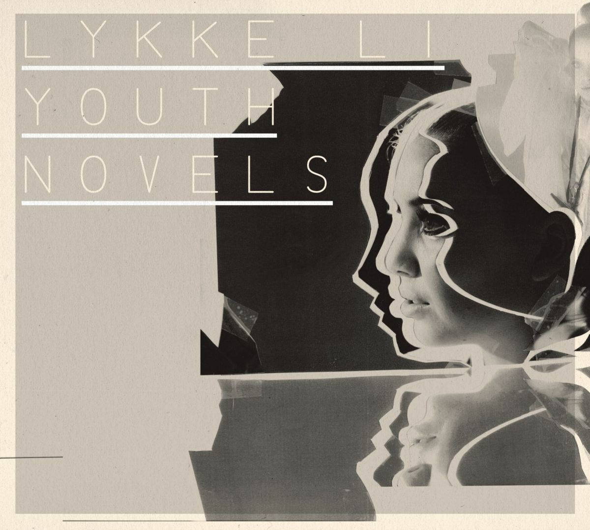
Lykke Li conforms to several indie-pop album conventions as she includes the album and artist name on the front cover, uses muted colors, mixed media, as well as having grainy texture. This makes her album easily identifiable as an indie-pop album. The album uses a close up shot of the side profile of the artist, Lykke Li, as one of the features of the cover. Although it conforms to more conventions of indie-pop albums, compared to the Beatopia album, I think that this album doesn’t really attract my eyes and comes off as rather bland and doesn’t really capture the audience’s attention.
The back cover of this album, again not only is bland but uses a font that is difficult to read. The tracklist font sort of blends in with the background as not only is it thin but it also has a similar color with the background. Unfortunately, I couldn’t find any images of this album’s CD cover.
Lykke Li doesn’t have a logo, however, she still shows her branding effectively as mysterious and melancholic where she often uses monochrome visuals, as well as raw photography using medium-close ups on her products.
This album has influenced me as I know what not to do for the digipak for our music video, which is not to use bland colors or fonts that are too thin or similar in color with the background so that audiences can easily read as well as be attracted to the album. However, the use of mixed media where she uses a photograph of herself and mixes it with digital elements is interesting, so I may take this as inspiration for our digipak.
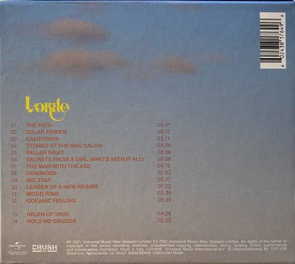
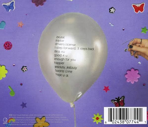
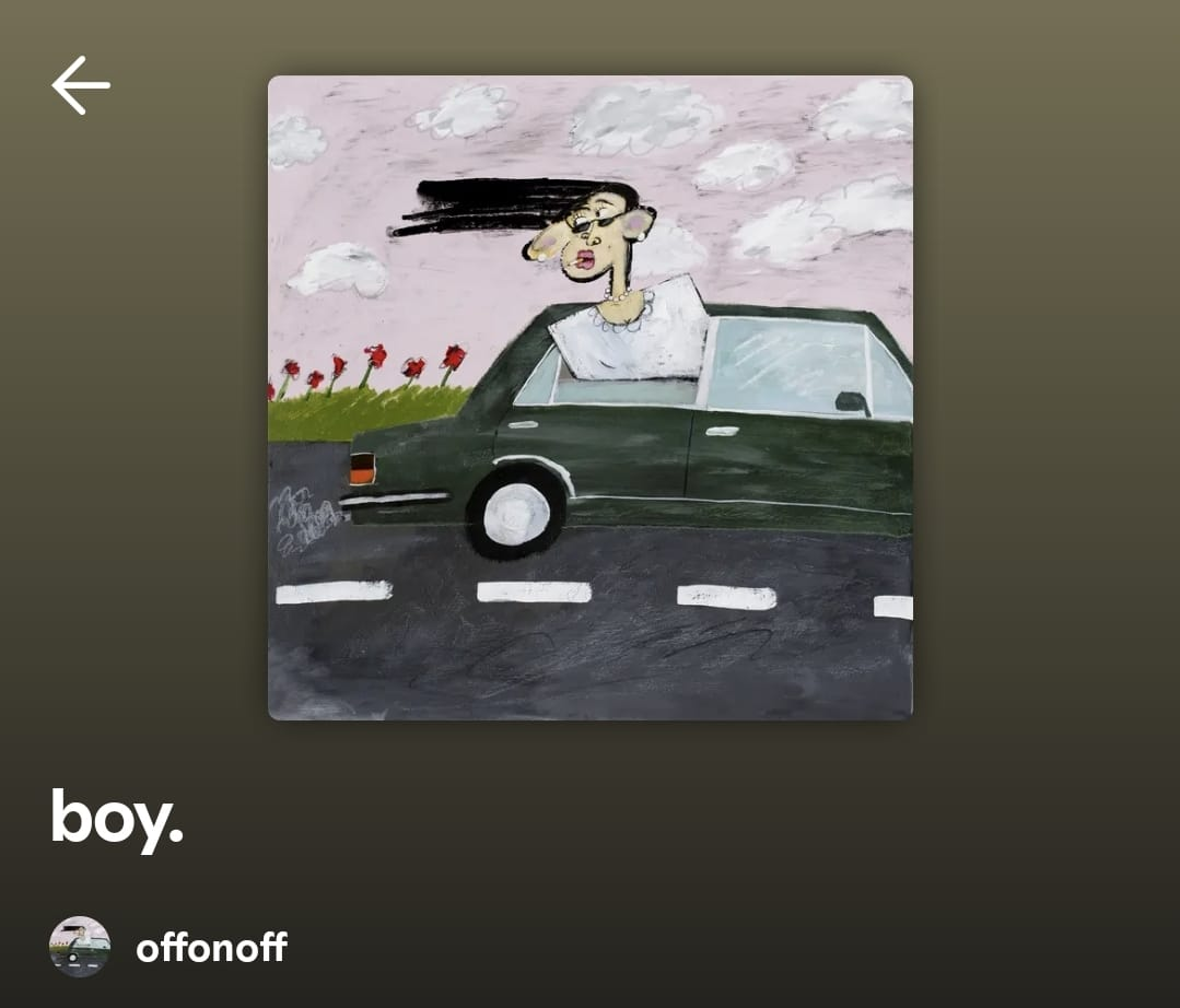
Below are other 7 album covers that I have researched and found inspiring.
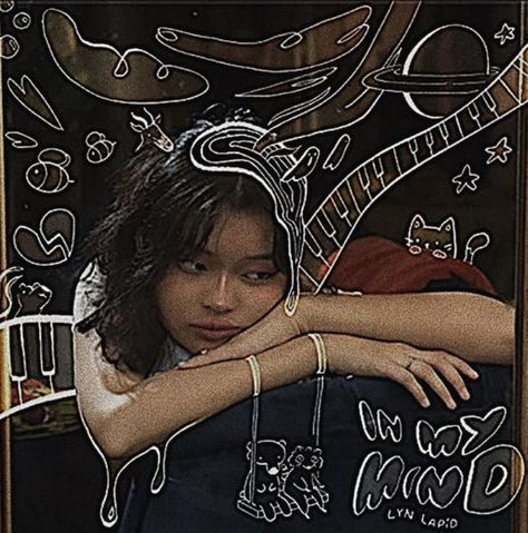
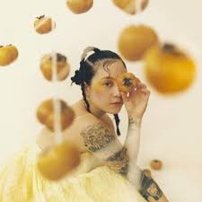
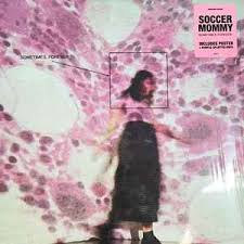
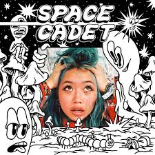
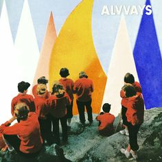
I really like how mixed media is utilized on the ‘In My Mind’ (top left) and ‘Space Cadet’ (bottom left) albums. Moreover, the hue, as well as tone of colors for the ‘Japanese Breakfast’ and ‘Sometimes, Forever’ album portrays a nostalgic and bittersweet feeling, which is exactly what me and my teammates plan to convey in our music video, as well as digipak as our theme is separation and graduation; friends going separate ways to chase their own dreams/live a new life. I will definitely take these considerations into note and use these album covers as inspirations for our digipak.
Below are 6 CD covers that I have researched and found inspiring.
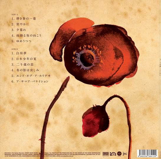

I really like the simplicity of these back covers as it allows for the tracklist to be easily readable, as it doesn’t completely take away the audience’s focus from it. Moreover, the grainy texture used for the Lamp album covers (position) gives off a sense of nostalgia, which correlates to our theme – graduation and friendships. I believe that it symbolizes the bittersweet feeling that comes with graduating, how we’ve closed a chapter of our lives to open a new one, and how the once cherished memories eventually fade away as time goes on. Most of them use pictures of sceneries or landscapes, I think that it's simple enough so that it doesn’t take away the focus from the tracklist but isn’t too simple that it looks bland.
Below is the research I have done on album titles
After several research, I chose 6 of these album titles as inspiration. Although some of these albums are old, I still chose to take them as inspiration because their one-word titles are very simple yet powerful. It evokes a strong emotion as well as helps to get the audience to remember the album title more easily. If audiences remember the album title easily, it can lead to higher sales and revenue as well as recognition for the album. I would like to take inspiration from these for our album title.
According to the research I’ve done, here are a few options for the album title that I’ve made:
Us.
Nostalgia
Chapters
Forever
Timelines
Unwritten
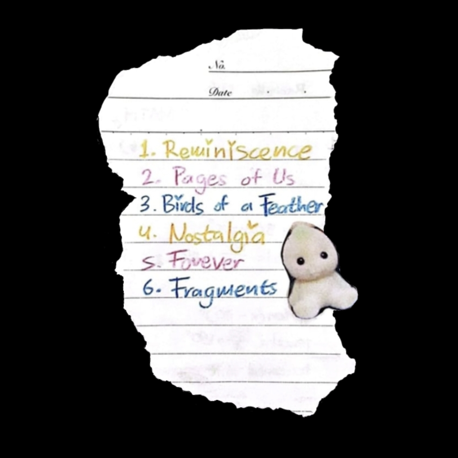
Fragments
Reminiscence
After a discussion with my teammates, we decided on the album title “Reminiscence” as it perfectly captures the bittersweet feelings of looking back on the memories shared with our past friends. The word evokes nostalgia. Why I didn’t choose nostalgia was because although it conveys a sense of longing for the past, the word reminiscence has a more personal touch to it.
After reviewing with our teacher, I discovered that most album titles are just the title of an artist’s most popular song. With this discovery, I researched this convention on Spotify, a famous digital music and podcast app. Below are examples of albums with one of the artist’s songs as its title.
Love Goes – Sam Smith
Glue Song – Beabadoobee
Marching in Time – Tremonti
Future Nostalgia – Dua Lipa
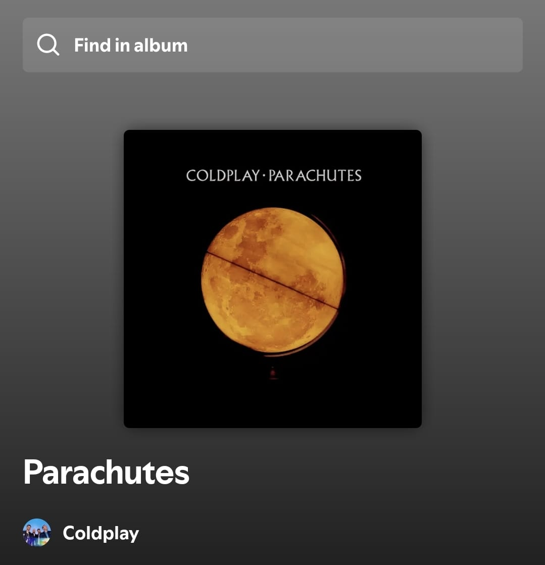
Moon Music – Coldplay
People Watching – Sam Fender
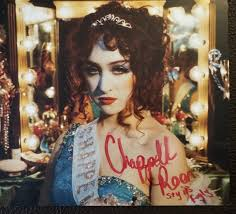
Additionally, Jasmine had suggested that a signed poster in addition to the digipak would be good and I agreed as it adds a personal touch to the album and makes it seem like a “limited-edition” product, which can encourage audiences to purchase the album so that they don’t “miss out”. An example of this is the Chapel Roan signed poster in her recent album, I’ve pasted a picture of it below.
Below is the adaptation we made of it:
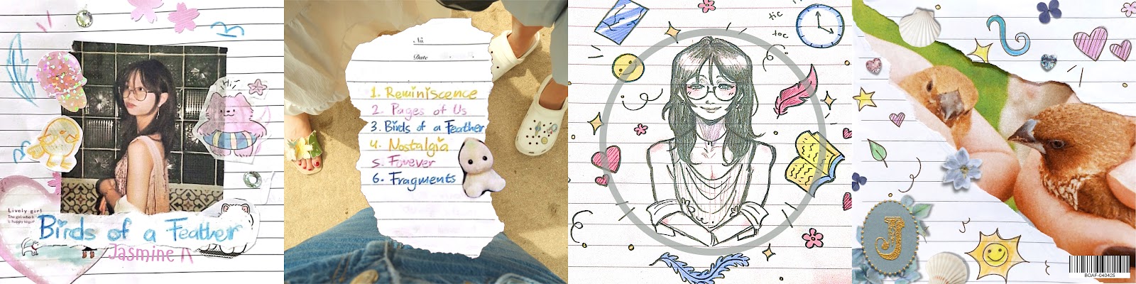
Here are the drafts I’ve made for digipak. I first sketched them out on paper, then developed the best options in detail.
Front Cover
Sketch:
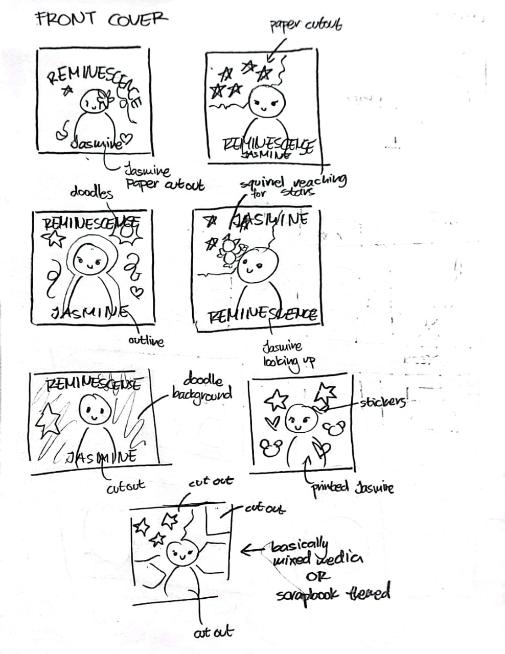
Development:
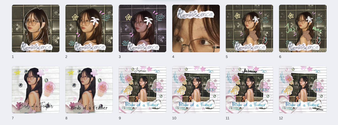
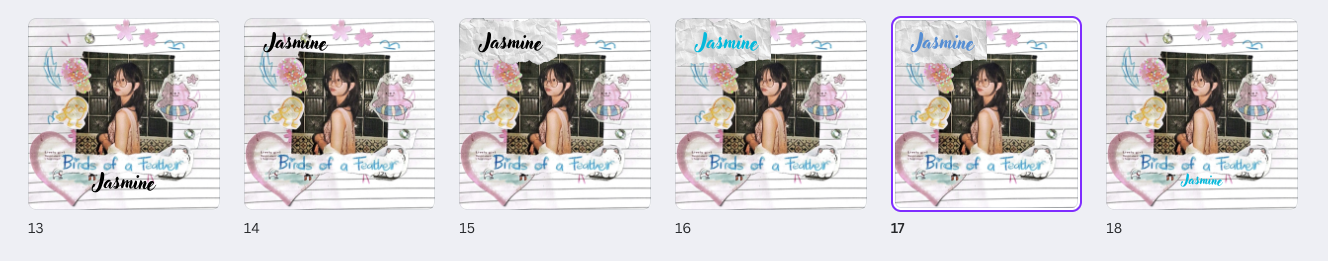
Above are the mock-ups for the front cover that I made. I experimented with fonts such as handwritten, digital, as well as both. I compiled all the mock-ups into Canva so that it’s easier to organize. At first, I used digital drawings on the artist’s picture (Jasmine) as seen on the 1st to 6th mock-up. However, I wanted to experiment more as it didn’t look good enough due to the dark aesthetic which didn’t match the aesthetic we had on most scenes in our music video, therefore it won’t create a good branding. I then tried to make a scrapbook themed cover with stickers, handwritten titles, and drawings. I glued everything together using paper glue and stuck them onto a notebook and blank A4 paper. I didn’t quite like how mock-up 7 and 8 looked as it seemed rather empty and didn’t have enough colors. I then further experimented on fonts and font colors for the rest of the mock-ups.

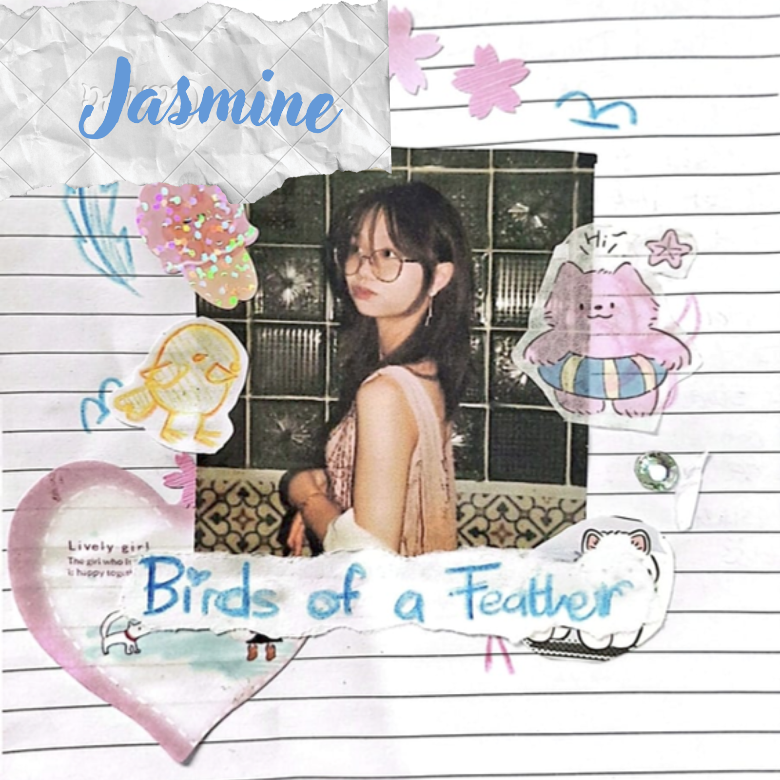
We decided to choose mock-up number 17 as our front cover. This is because not only does the color scheme match with our branding, but is unique as not many indie-pop albums do scrapbook themes, even if they’re mixed media. This can help differentiate our album from other artists, therefore customers can recognize our album more easily. I love how the overall look gives a sense of nostalgia, from the color scheme to the way stickers and everything were done on a notebook as it brings the audience back to their childhood or teenage years, where they used to have cute stickers, use colorful/pastel colors for everything, etc. The contrast between the dark picture and bright decorations portray the bittersweet feeling of separation, which is our theme, where we feel happy yet a side of us can’t help but mourn for the lost relationships/friendships.
Back Cover
Sketch:
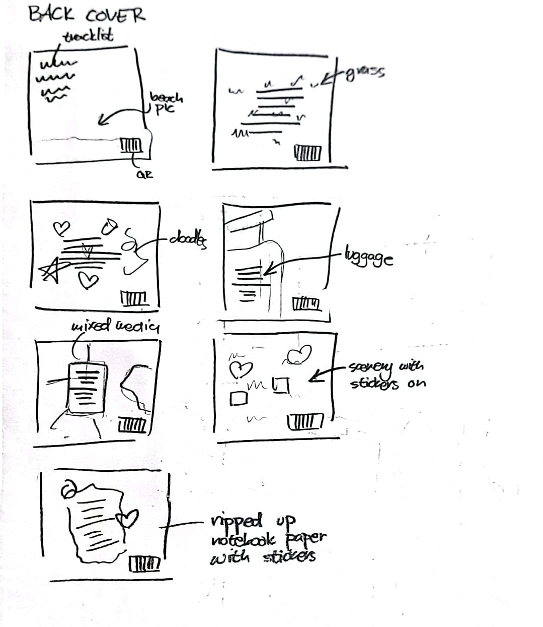
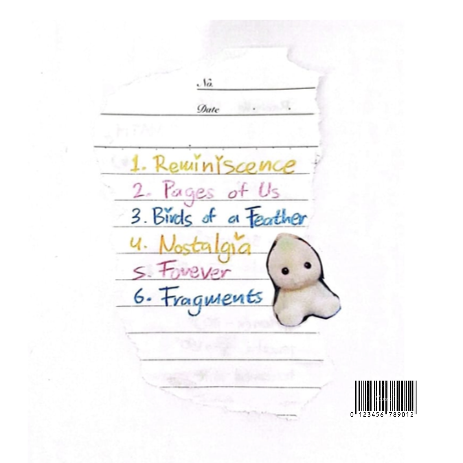
Development:
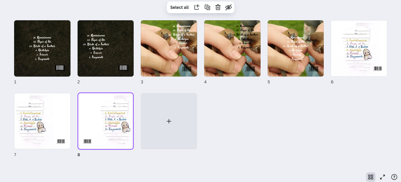
I decided to try to put a grass picture for the back cover but it was too dark, and again, didn’t match with our branding. I didn’t take the bird picture as it didn’t fit my research, which was to have a simple back cover. For the mock-ups 5-8, I decided to match the colors and aesthetic with the front cover so that the digipak looks well put together as a whole. I ripped up the notebook which I wrote the tracklist on and stuck it onto a blank piece of A4 paper then stuck a sticker onto it. In the mock-ups, I experimented on the position of the illustration to see which one looks the best.
Inside
Sketch:
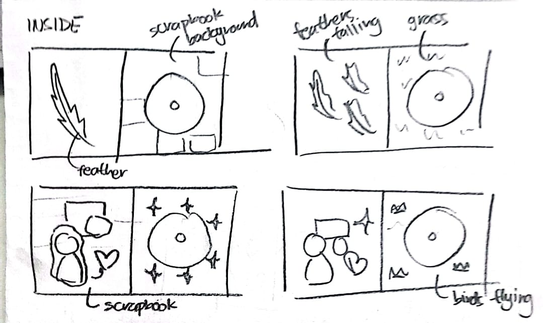
Development:
Chosen:

.png)
.png)

.png)
.png)
.png)
.png)
.png)
.png)
.png)
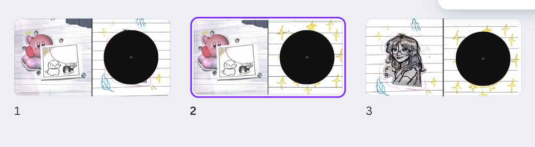
Front Cover Changes:
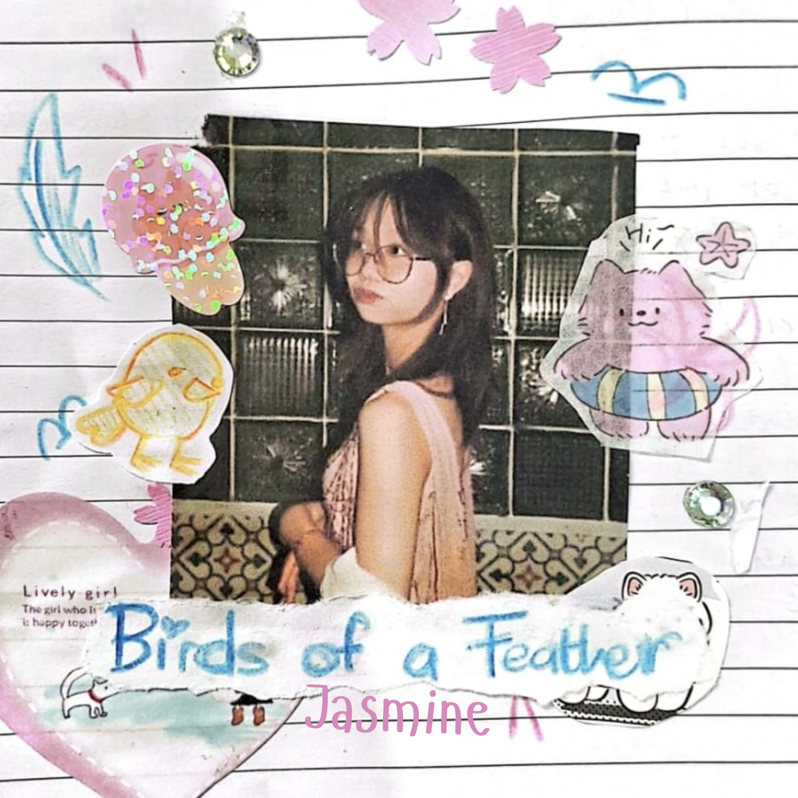
The first image was the initial design made by Rachelle, the second was a minor edit I made to improve the design. I got feedback from my media teacher saying that the image should be more zoomed in so that it would seem like part of a notebook filled with doodles instead of just images stuck on a blank notebook. I agreed with this feedback because making the image seem as part of a notebook would seem more personal, natural and handcrafted, which was part of our star’s persona. Another edit I made was removing the paper element and the name of the star on the top left of the cover. This was mainly because the paper element was a paid Canva asset; therefore, the logo could be seen and that wasn’t professional. Instead, I moved the star’s name to the bottom middle of the cover, changing the colour to pink too, since I didn’t want blue to be overly dominant in colour. In addition, I also changed the font as it seemed more young and childlike, in addition to being more readable.
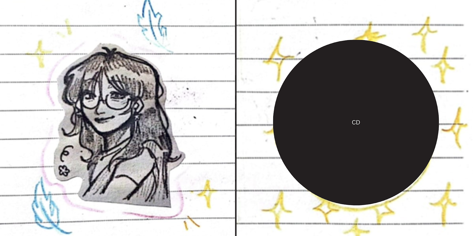
Here is the previous design made by my other teammate, Rachelle.

This design was made suddenly and only on the deadline day, so there were many flaws. Although the concept was what we intended it to be, with the handmade concept and illustrations, it was very messy. Our media teacher gave us feedback and suggested we draw elements based on the tracklist to add to the album so that it would be more relevant towards the album as a whole. Since my teammate, Rachelle, isn’t submitting this project for her A levels, I had to edit the inside myself.
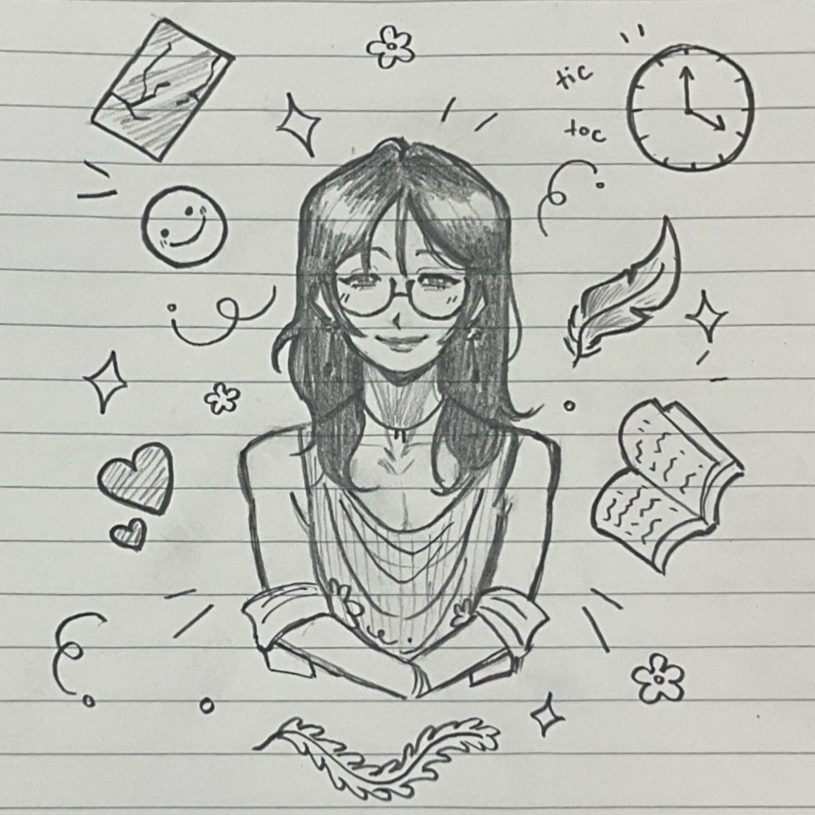
Here is a drawing I made based on what my teacher suggested! I drew the star, Jasmine, in my stylised art style, surrounded by doodles based on the songs in the tracklist. Although I felt like this was alright, the doodles were a bit too small, so I decided to fill the drawing with more doodles to fill up more of the page so that it would seem fuller.
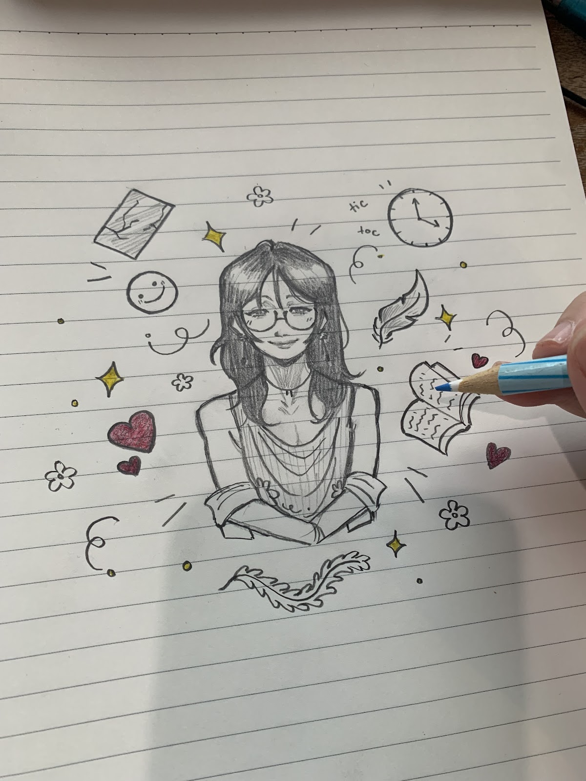
After doing so, I started to colour the sketches with a pencil, however, I realised that the colours became muddy when I did so. Instead, thankfully, I took a picture of the uncoloured drawing as a precaution beforehand, and so I decided to use that. I added the sketch to a drawing program called Procreate, and adjusted the lighting to be brighter, matching the front cover of the digipak. After doing so, I decided to digitally colour the sketch using the “multiply” feature so that the colours would overlay the drawing. Overall, this gave me more control over the colours as I was able to tweak the colours if it felt like they needed to be edited, and I was able to restart if it felt like I needed to change some things. In addition, I was able to use the “liquify” tool to tweak some of the proportions of the drawing that I felt were bothering me before.
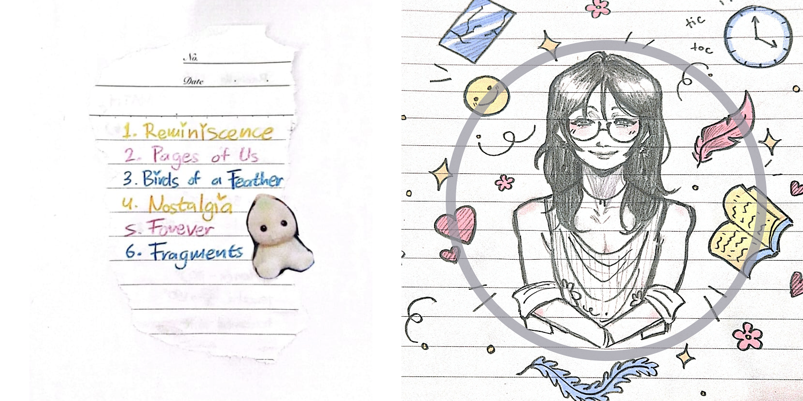
I also decided to have the tracklist be inside the digipak instead of using it as the back cover like we had previously planned. I thought this was a good idea since the illustration I made reflects the songs on the tracklist, so it would be easier for the audience to understand the references if the drawing and the tracklist were on one page. I also just felt that the tracklist was too blank to be put on the back cover alone. Although this draft felt like it was significantly better than the previous digipak content, it felt like it was missing something. After noticing this, I asked for feedback from my media teacher, who told me to try experimenting with different backgrounds for the tracklist. It honestly was a very simple suggestion so I was ashamed I didn’t think about doing it first, however, I immediately got some ideas after the suggestion.
First, I asked my teammate, Rachelle, to take a picture of the tracklist paper with a dark or black background so it would be easier to delete the background. If the background were white, it would blend with the paper, making it hard to separate. After getting this image, I used my program, Procreate, again. Using the automatic select tool, I selected all the areas that were black and deleted them. Although I thought this would be easy, an issue arose. This issue was that when I deleted the background, a thin black outline would remain at the edges of the paper. I tried to fix this.
As seen here, the picture on the left is before I fixed the issue, and the picture on the right is after I fixed it. Removing the black outline was almost impossible and very time-consuming, so instead, I selected the areas with the black outline, replacing it with a brown colour instead. Although this doesn’t seem to change much, the previous black outline was very harsh and didn’t match the light colored background, standing out too much. Changing this outline to brown made it seem much more natural, making the edges look burnt instead, which helps to support an overall handmade vibe.
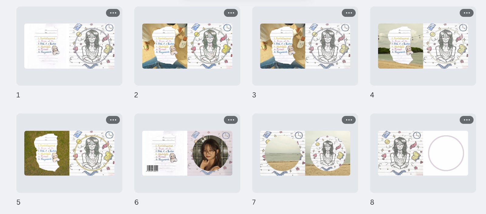
Here are some drafts that I made on Canva. It took me a lot of time to decide which one we were going to use but in the end, we made a decision.
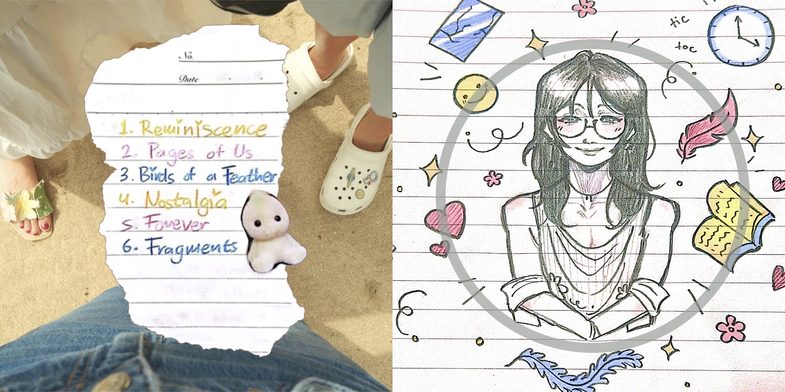
We chose this image in the end. One of the main reasons was that it was just more visually appealing compared to the others. Another reason was that the background with the legs on the beach shows friendship, which is one of our star’s personality traits (REEL). In addition, I edited the illustrations to become more vibrant, as previously, they felt too monotone and bland. This way, it would be more eye-catching! Overall, I don’t think that it is the best, however, I think that it is all I can do given the limited timeframe. I tried to keep the front cover of the digipak in mind while creating this.
After making the inside and editing the front page of the digipak, as well as receiving Beatrice’s design for the back cover, I compiled all of them into one image. Initially, I wanted to use a mockup application so that I would be able to better visualise the design, however, I couldn’t find one in the end, and this was the best I could do. After doing this, I found that the colours for each part of the digipak were slightly different, so I made sure to edit them so that they seemed more consistent and part of a single digipak. Although I think that the digipak looks a bit inconsistent since each part was technically made by separate people, I think that it was definitely a big improvement from the previous one, and I am very satisfied! The hand-drawn aspect definitely shone through, and it looks very whimsical as intended!
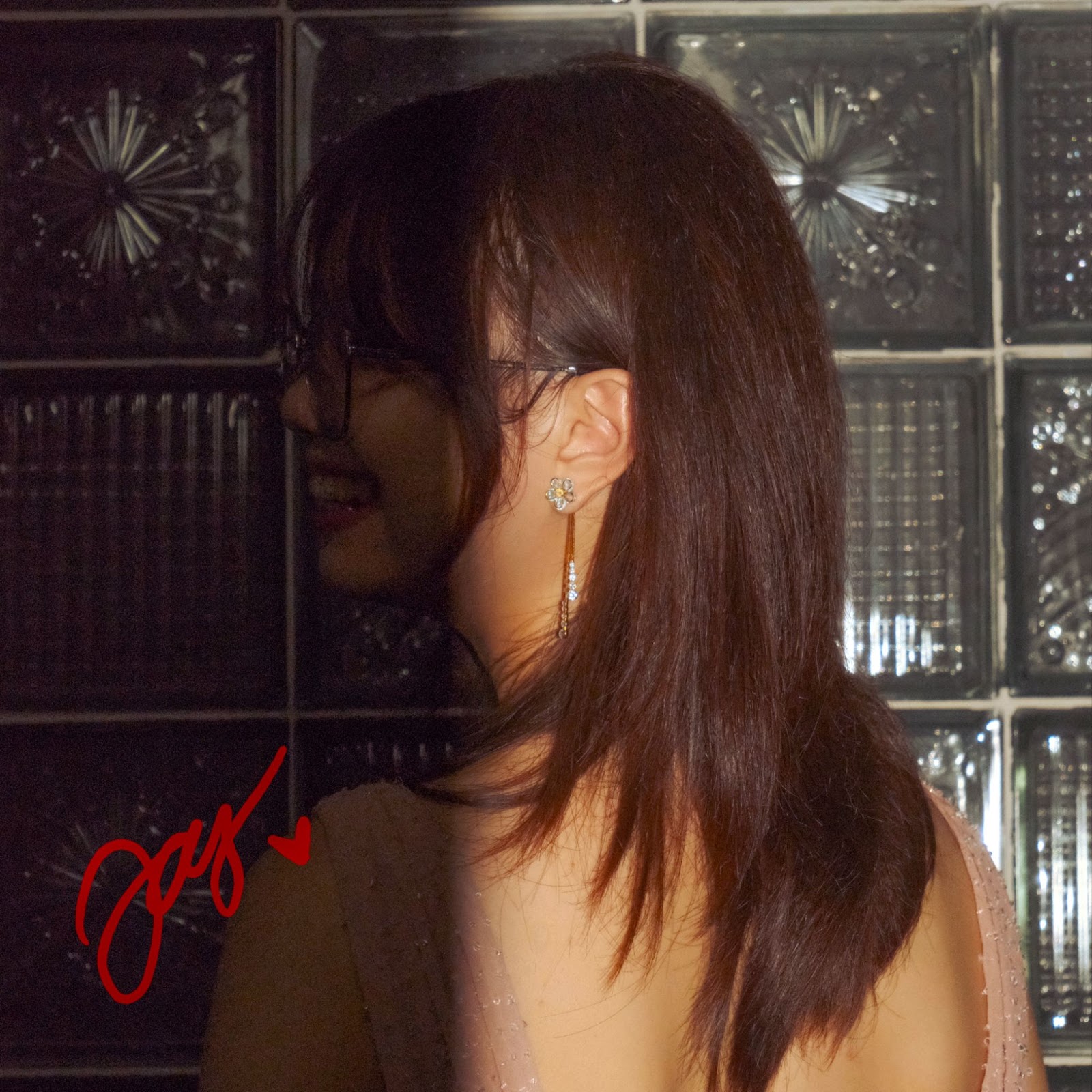
Additionally, based on a previous idea I suggested, I created a signed poster for the digipak! Although this wasn’t required for the project, I thought it would be able to support my star’s persona.
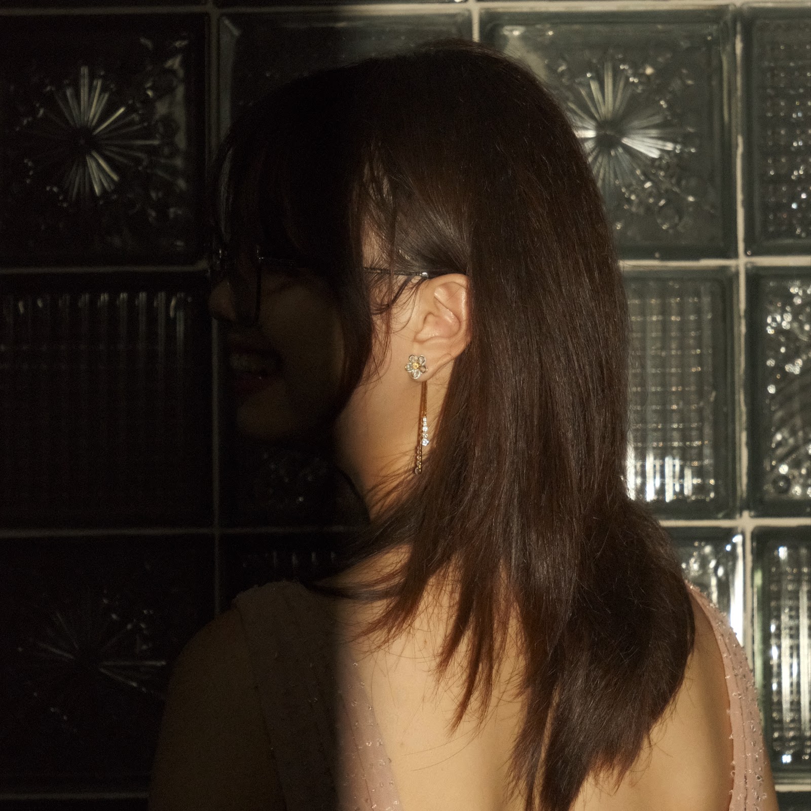
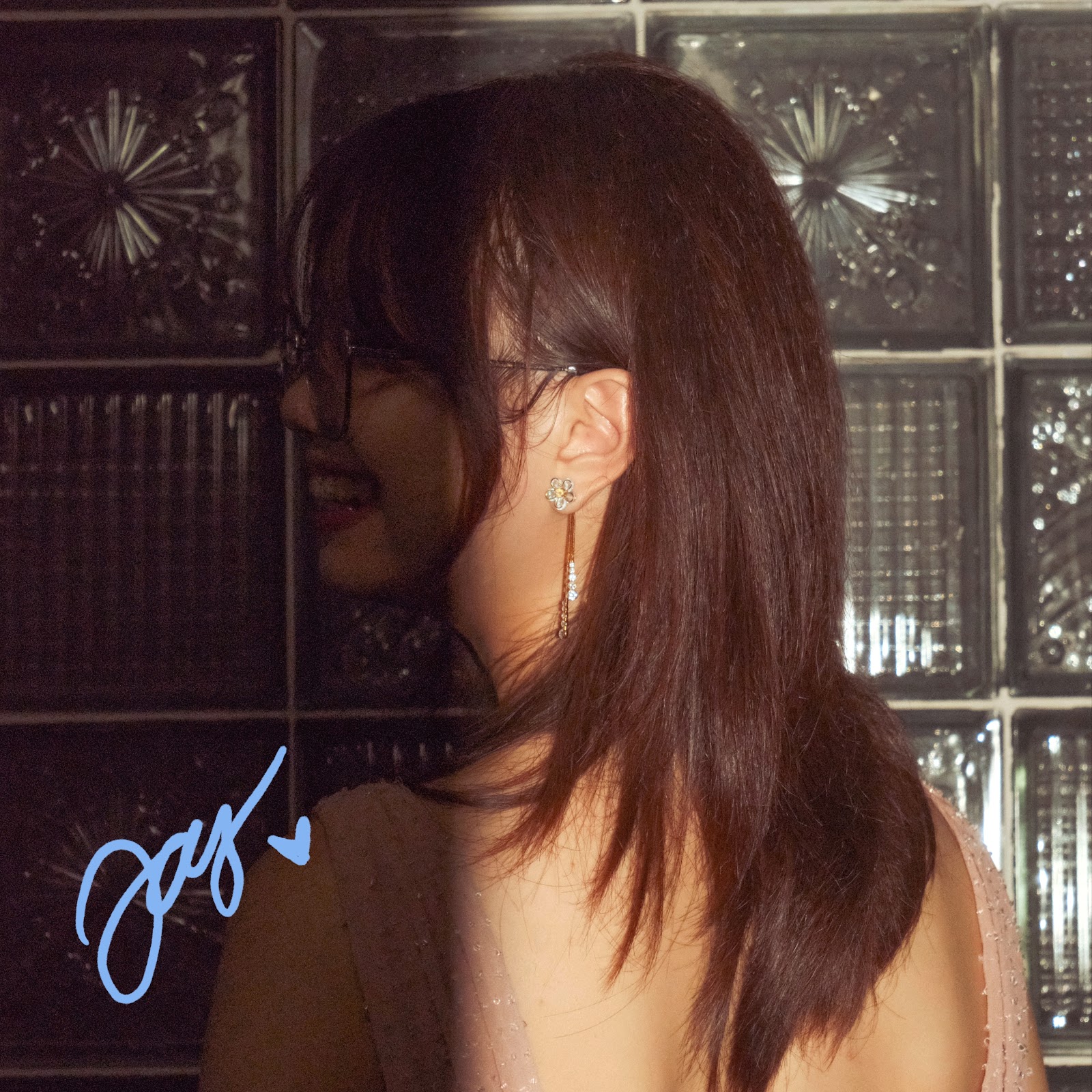
The first image was before editing and colour grading the image, and the second is after! I made sure to colour grade the image so that the subject was visible for the audience to see properly. I did this using the program called Adobe Lightroom. In addition, I also made the colours more saturated as it would be more eye-catching and would also fit the digipak more. The signature was added by me using a digital program, Procreate. The lighting for this image made for a pretty unique and interesting composition, so I thought it would be eye-catching for the audience.
No comments:
Post a Comment