How Magazines Are Displayed in Japan
When I went to Japan for immersion, I went to a CD store and found a magazine section there so I decided to take a look. I've noticed that several magazines are displayed differently in Japan. Although it is typically displayed similarly to those in Indonesia, the publications displayed there may differ depending on the location of the place. The images above depict how magazines are displayed in a Japanese CD store. Typically, if it is a magazine of a celebrity (usually singers or models), the company is willing to spend a large sum of money for their magazine to be exhibited in a rack only for them, without any other publications, so that the audience's attention is drawn solely to it. Magazines are stacked without overlapping each other and are categorized based on the celebrity so it is usually easier to search for the magazines that people wants. However, the expense of displaying the publications in this manner may be significantly higher.
COVER PAGE ANALYSIS ; COSMOPOLITAN
FEATURING HALLE BAILEY
This is my cover page analysis of the most recent, latest issue of Cosmopolitan Magazine, featuring Halle Bailey, a well known actress after playing as Ariel in 'The Little Mermaid' movie that is distributed by Walt Disney.
COSMOPOLITAN
Hearst Corporation.
COSMOPOLITAN is an American monthly magazine for women produced by Hearst Corporation in the United States. It focuses women's fashion, careers, celebrities, self improvements and beauty and it is marketed to more of a women empowerment publication.
Genre : Fashion, Beauty, Lifestyle.
Demographics :
Age : 18 - 34
Gender : Female
Location : North America and Asia
Income : upper class
Education : people with higher education, English language speaker.
Star Appeal : Singers and Actresses, mainly Halle Bailey.
Psychographics :
Personality and behaviour : independent, positive, out for fun.
Lifestyle : active, successful, spends money on high end products.
Hobbies and Interests : fashion, self care, celebrities, love.
Media Language and Representations :
Typical fashion magazines usually dresses up their models by using fancy and lavish clothing to make them appear fashionable. This magazine conforms to that convention, however, the genre conventions of a fashion magazine is to only have a little bit of coverline. Subverting to this, this magazine has a lot more coverlines than the others. The magazine's main image is a picture featuring Halle Bailey, a well known singer and actress. During the time of this magazine's release, Halle Bailey's popularity was skyrocketing due to her role as the main character in the new 'The Little Mermaid' movie. This use of star appeal is can be used to increase the likelihood of the magazine being purchased.
Audience :
This magazine has a very broad audience. It features a large age gap, with most of the female being between the ages of 18 and 34. Since the ideology of the cosmopolitan magazine is for independent, strong, adventurous and daring women, audiences may believe that Halle Bailey fits the bill well because of her recent role in the mermaid movie, in which she is viewed as the above description.
FURTHER ANALYSIS
Language used in the cover lines :
The language utilized in the coverlines appears to be very interactive. Using words such as 'You' and 'Y'all' provides direct mode of address, making it sound more personal towards the readers. The phrase 'Everyone' makes it more relatable to the readers. Including questions in the coverlines can also pique readers' curiosity, making them intrigued and wants to find out more about it which increase their likelihood of purchasing the magazine.
Camera Angle, Facial Expression :
For the main image, a cowboy shot was used as the camera angle. Given that the genre of this magazine is a fashion magazine, they used this camera angle to display the entire outfit, from head to thighs. Additionally, they took advantage of this perspective to give her a more powerful and dominant appearance, which fits the magazine's ideology perfectly. Her face is directly faced towards the camera and she is looking directly at the camera with eye-level angle while smiling, giving a friendlier approach towards the audience since it helps to build up connection between the the two (magazine and customers). Having eye-level angle also gives direct mode of address which is also used in the coverlines of this magazine.
Outfit and Style, Body Language :
In my opinion, Halle Bailey appears to look very brave and confident, a disciplined individual who is always ready to face challenges. This is conveyed through the clothing she wore on the cover. She dresses in tight clothes and wears a skirt to appear more courageous and confident. Her overall fit seems a lot more exquisite and full due to her fur coat. They also added black boots to make her outfit looks bold and much more complete. Not only does her clothing affect her persona, but so does her body language. One of her legs is in front of the other, giving the impression that she is taking a step forward. Furthermore, they tied her hair back, giving the idea that she is 'ready' to deal with whatever challenges that comes her way and making her look a lot more authoritative, having that 'leadership' spirit within her. Her left hand is placed on her left shoulder (the shoulder closest to the camera) to allow audiences to look straight at her, attempting to demonstrate that 'she is her, the one and only, Halle Bailey' and hoping to demonstrate her charisma.
Adverts :
As stated in the coverline, I believe that beauty and selfcare products such as perfumes, makeup, and skincare will most likely appear in this magazine. Because the genre of this magazine is a fashion magazine, it will include fashion-related items such as jewelry, clothing, and fashion trends.
Typography :
The font used for the title 'COSMOPOLITAN' is Franklin Gothic Extra Condensed. This typeface was chosen because it is thick and bold. They also decided to increase the title size and use capslock since it makes the magazine appear more powerful and dominant, especially when the masthead is positioned behind Halle. The coverlines on the page features the singer 'Taylor Swift' and 'Halle Bailey' with a slightly larger font than other coverlines to highlight the name of the singer. This use of star appeal is to attract the audiences' attention and and increase the likelihood of it being purchased by her admirers. In addition, all of the text's is brighter than the background, allowing it stand out more, and making it easier to read.
Colour Theory :
The main colour used in the magazine is green. From the background to the typefaces and even the outfit. I believe that they choose this colour since green is a very down to earth colour so it helps the magazine to appear more fresh. This improves the magazine's visual appeal. The green colour also compliments Halle's skin tone really well as green and brown complements each other. The two significant colors chosen provide great contrast as a result of the color balance, which might be appealing to readers. As a result, it is difficult to look away from the magazine since Halle appears to be stunning and dominant which helps her to become the magazine's main point of view.
Additional Critique and Feedbacks (Overall Opinions) :
Personally, I think that the green colour is a bit too much which makes it a little overwhelming. As someone who is not a big fan of green, I think it would be better if they mixed in some other colours, such as red, because red is green's complementary colour. The addition of red will help the subject become the focal point, so it is ideal to place it on the masthead (since it is the title of the magazine) or the outfit. However, if the masthead / outfit is changed to red, the color of the coverlines should also be adjusted so that it does not appear to be underwhelming. Aside from that, I think the cover is already very enjoyable. From the poses to the primary coverlines and even Halle's makeup. The cover concept has been thoroughly planned out, which makes it appealing to the audience.
Conclusion :
What I've learned from analyzing the cover of this magazine is that it will be better if a variety of hues are used in the magazine to provide variation to the eye so it will be more appealing to the audience. Perhaps not too many colors, but just enough to make it appear intriguing. As a result, I will be using variety of colours in my magazine cover.
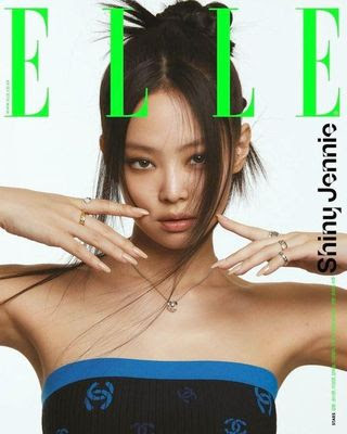
COVER PAGE ANALYSIS ; ELLE
FEATURING ZENDAYA
This is my cover page analysis of the ELLE Canada's April 2023 issue. This magazine was released in April 2023, featuring Zendaya, a well known actress and singer.
ELLE
Lagardère Group
ELLE is a worldwide women's magazine of French origin that is produced by the Lagardère Group. It offers a mix of fashion and beauty content, together with culture, society and lifestyle.
Genre : Fashion, Beauty, Lifestyle.
Demographics :
Age : 19 - 49
Gender : Female
Location : Worldwide
Income : upper class
Education : people with higher education.
Star Appeal : Singer and Actress, Zendaya.
Psychographics :
Personality and behaviour : elegant and classy, positive, happy.
Lifestyle : active, sociable, successful, rich.
Hobbies and Interests : fashion, beauty and aesthetics.
Media Languange and Representations :
Generic conventions of fashion magazine covers are tends to be dominated by a single model. As a result, it demonstrates that this magazine conforms that convention. However, the fashion magazine genre norm is that there will likely be no coverline in between the letters of the masthead. Subverting, they placed one of the coverlines between the masthead which makes it appear unusual.
Audience :
This magazine has a wide range of audience. Since the title 'ELLE' means the word 'she' or 'her' in French, the main target audience of this magazine is most definitely female. It also features a large age gap from age 19 - 49. Because the ideology of Elle magazine is fashion, beauty and style, the audience will mostly be women who are interested in fashion and aesthetics. People with fashion-related careers / majors such as fashion designer, fashion stylist, fashion photographer, etc will most certainly be interested in this magazine as well.
FURTHER ANALYSIS
Camera Angle :
Since it is a fashion magazine, cowboy shot was used for the main image so that they can capture her from her head to thighs to show her entire outfit. They also lowered the camera angle, making Zendaya appear more powerful and authoritative, as a low camera angle is utilized to make the subject appear taller and closer.
Adverts and Content :
I think there will be advertisements of fashion products such as jewelries, makeup and most importantly, outfits that are designed by famous designers. As stated in the coverlines, the magazine will be filled about fashion styles and beauty trends that are suitable for spring and summer. They will also discus how biomimicry is set to take over the beauty industry. In addition, they might also feature professional makeup tips and interview with the rising style icon, Zendaya.
Typography :
The font chosen for the title 'ELLE' is Didot, which is a serif font. They chose this typeface because it appears to be visually appealing and elegant, which fits with the magazine's ideology. It looks extremely appealing given that the font has clear letterforms and adequate space. As a result, it is very easy to read. The font itself is rarely utilized by other brands or companies to keep the brand's originality, so that the brand stands out and differs from the others. To help draw the audience's attention to the coverlines, only capital letters are employed. The phrase 'FASHION & BEAUTY' is written in bold, making it appear thicker than the other words in the coverlines. It is utilized to highlight and attract the attention of the audience to the main focus of the magazine. Zendaya's name is typed larger than others due to the fact she is the magazine's star appeal. Because Zendaya is well-known, this can be used to pique the interest of the audience. People who are unfamiliar with Zendaya may also be intrigued in learning more about her. As a result, Zendaya has a significant influence on the possibility of the magazine being purchased.
Facial Expression and Body Language :
In my opinion, i think face expression and body language are very critical since they convey non-verbal messages. Zendaya appears to be incredibly powerful and domineering in the main image. She appears to be prepared to take action, and she commands the spotlight, making her appear brave and confident. This is demonstrated through her body language, in which she placed her hands on her hips. Her hands on her hips straighten her back, implying authority, while the open gesture implies transparency and readiness. Her face looks rather relaxed. This helps to convey her calm and professional demeanor. Because the camera angle is slightly lower than Zendaya, it appears as if she is looking down at the audience, making her appear menacing and establishing a sense of vulnerability for the viewers.
Outfit and Style :
Zendaya is dressed in a pretty simple attire, very minimalistic. Her shirt is paired with a white blazer and long pants. This makes her appear more classy, mature and confident, as white blazers are usually eye-catching because they stands out in a crowd. She appears more professional because blazer can elevate an outfit and make it suited for formal occasions. She wears a plain white outfit to match the magazine's color theme so that it does not distract the audience, as they may want the audience to focus on the coverlines or Zendaya herself instead.
Colour Scheme :
The magazine's color scheme appears to be monotonous. I suppose they chose grey since it is a neutral color that is flexible. As a result, it can set tones and create contrast or harmony with other elements. It also helps to draw the audience's attention directly to the masthead and coverlines. Because the target audience mainly consists of older females, the grey color can help make the design to appear more mature. The masthead and coverlines are typed in black to make them easier to read due to the significant contrast between the light grey background color. The name 'Zendaya' is typed in white for aesthetic purposes, as white fonts typically have a modern, clean, and minimalistic appearance. Personally, I believe Zendaya's outfit is planned to be white in order to maintain the monochromatic theme. The reason she isn't dressed in black is most likely because a black costume would draw attention away from the masthead, snatching the focal point and making Zendaya appear overly bold.
Additional Critique and Feedbacks (Overall Opinions) :
Personally, I think that the magazine colour is a bit underwhelming, making it quite boring to look at. Personally, I think the magazine color is a little lackluster, making it difficult to read. The magazine's lack of color makes it appear extremely mature, which may turn off the audience. It also lacks coverlines, which may either pique audiences' curiosity in finding out what is in the magazine or turn them off from buying it because they don't know what the contents are and would rather not waste their money. The positioning of the coverline is also disorganized, which may lead the audience to ponder which aspect to focus on first. Although Zendaya's name is put in a much larger font than the others, the name is not visually appealing since the color and font used to write Zendaya's name are too plain. I believe it would be better if they used a thicker font or modified the color because it lacks contrast considering that it is nearly the same color as her outfit. Nevertheless, the poses and expressions are already on point to what they are trying to represent.
Conclusion :
By analyzing this magazine cover, I discovered that coverlines are also highly significant for magazine covers because they inform the audience about the sneak peek of the contents. Colors are also crucial because if it's lack in colours, audiences would be dissatisfied. Finally, I realized that coverline positions are essential because an unstructured coverline position might mislead the viewer. Therefore, I will use a range of colors in my magazine and include more coverlines to attract my audience.
MAGAZINE ANALYSIS ; VOGUE
FEATURING KATE WINSLET
This is my magazine analysis of the latest issue of the Vogue Magazine that was released in October 2023, featuring Kate Winslet, a well-known English actress.
VOGUE
Condé Nast
VOGUE is an American monthly fashion and lifestyle magazine that has various topics. Its contents include haute couture fashion, beauty, culture, living, and runway. It is produced by Condé Nast company.
Genre : Fashion and Lifestyle
Media Language :
The generic conventions of typical fashion magazine is to feature a prominent photo of a celebrity (models, actresses or singers) or influential figure in the fashion industry, usually someone who is currently trending or has a broad appeal to the magazine's target audience. This Vogue magazine conforms to this conventions by featuring Kate Winslet, an well-known actress that is currently trending due to her role in 'Lee', the new movie that was released in 9th of September 2023. Dutch angle was used to shot the main image to make the cover stands out, catching the potential readers' eye amidst other magazines. This angle can also be utilized strategically to draw attention and highlight specific design features or characteristics of the model's outfit. This angle subverts the generic convention of fashion magazine, as the typical fashion magazine uses long shot and eye-to-eye angle shot. As mentioned in the coverline, this magazine is clearly directed at people who enjoy chic fashion and are interested in skincare, celebrities, and lifestyle. Mise-en-scene is extremely important in capturing the attention of the the audience. This magazine has a background with vivid analogous colors (pink-yellow-green), which provides a harmonious design that contributes to its visual appeal.
Representations :
Kate Winslet have been represented as strong, confident and empowering on the front cover of this magazine. Body language and facial expressions are used to convey this more effectively. She appears to be more dominant by placing her hands on her hips, enabling her to expand her presence. This posture also helps her appear more confident and assertive, as it suggests self-assurance. The slight smirk on her face indicates a sense of superiority, making her appear more authoritative. Since the film is based on Lee Miller, the one who took some of the most iconic images of the 20th century on the front lines of war, the double page depicts Kate Winslet's stoic face expression, which often relates to calm and unemotional. Winslet's makeup also appears natural and sharp. It emphasizes her sharp and dominant facial features, giving her a more firmer appearance. Her black attire also reflects her professionalism.
Audience :
The target audience for vogue are typically women around the age of 20 - 40 who have an interest in fashion, beauty, culture, lifestyle, and celebrity contents. According to the theory of Uses and Gratification, the audience may desire to read this magazine for inspiration and to keep up with the latest trends. Representation theory is also employed to draw audiences' attention because this magazine is filled with representations of beauty and lifestyle which they may want to learn more about. Although dutch angle is used for the main image's shot, Kate Winslet is looking directly into the camera lens, providing a direct mode of address that helps to create a sense of familiarity and connection to the audience. This increases the potential of the magazine being purchased.
Industry :
In addition to print publications, Vogue publishes its magazine online with an extensive range of material. Since they have a strong internet presence, this gives them a good position within the media industry. This is crucial since, due to advancements in technology, people these days frequently undertake internet research in order to receive results quicker. Like many magazine, vogue's revenues comes from advertising so this magazine features ads from luxury brands, fashion houses and beauty companies. This is extremely important since readers typically purchase this kind of magazine to look up recommendations for beauty brands.
MAGAZINE ANALYSIS ; DIOR
FEATURING NATHALIA NOVAS AND OLIVIA MARTIN
This is my magazine analysis of the Dior Magazine No. 40. Andalusian Grace, Winter Edition that was released in December 2022, featuring Nathalia Novas and Olivia Martin, a professional fashion model.
DIOR
Baron & Baron
Dior is one of the world's leading luxury fashion brands. Founded by the designer Christian Dior in 1946, the brand's headquarters is situated in Paris, France.
Genre : Fashion, Accessories and Beauty
Media Language :
Typical generic convention of a magazine uses a long shot for the magazine cover to show the outfit of the model from top to bottom since it is usually the main focus of the magazine. This magazine conforms to the generic convention as they utilize the long shot camera angle to take the picture of the main cover's image. However, this magazine subverts to the conventions of the magazine by featuring two fashion models in the cover image as typical fashion magazines only features one model to focus on. The use of mise-en-scene is crucial to attract audiences' attention more effectively. The dresses on the models give the front cover an attractive appearance. It appears to me that the mountain background in the main cover is being captured in dim lighting, with white serving as the main colour. This indicates that the magazine is a winter edition since the mise-en-scene contributes to its chilly appearance. This magazine also features illustrations of outfit designs that was created by a fashion illustrator, Mats Gustafson. This subverts to the genre convention of fashion magazines as typical fashion magazine doesn't include this. However, this will most likely have a good impact for the magazine as the illustrations includes personal touch to it, making them have a connection between the magazine and audience.
Representations :
Models are typically represented as elegant and beautiful in a fashion magazine. The choice of outfit and makeup is usually the key to this. The flowy dresses that are used by the models suggests elegance and grace, represents femininity. The movement of the dress mimics the gentle sway of nature, therefore, it can represent nature and naturalism which gives a sense of familiarity to the audience. The model represents two different audiences. Nathalia Novas represents black people because of her darker skin tone while Olivia Martin represents white people as her she has a lighter skin tone. This can create a visual impact aesthetically since the contrast between the skin tones creates a striking visual effect. It also communicates a message of diversity and inclusivity, signaling that the magazine values and represents people from all racial and ethnic background.
Audience :
The target audience for Dior magazines are usually people with high-income bracket who can afford and appreciate high end products. Therefore, this magazine's main cover image is elegant and attractive, with the masthead typed in gold to give the impression that it is more "expensive". Dior's magazine targets youthful, fashion-forward adult readers, often those between the ages of 15 and 38. Because of this, the primary cover usually appears more sophisticated and minimalistic—not overwhelming or underwhelming. Due to the inclusion of people from different racial backgrounds on the magazine's cover, it may appeal to a larger readership and draw in a wider spectrum of consumers, which may potentially increase sales.
Industry :
Since Dior has a wide range of audience, it is easier for them to reach their target audience by having an official website of it. Since Dior is a global luxury brand, they also published their magazines in various languages other than English such as Chinese, French and Arabic which means that they tend to have a central theme or set of contents for each issue, but there may be variations based on their regional preferences and events.
MAGAZINE ANALYSIS ; ELLE
FEATURING IMAAN HAMMAM

;.
This is my magazine analysis of the ELLE Indonesia Magazine that was released in September 2023, featuring Imaan Hammam, a Dutch fashion model.
ELLE
Lagardère Group
ELLE is a worldwide women's magazine of French origin that is produced by the Lagardère Group. It offers a mix of fashion and beauty content, together with culture, society and lifestyle.
Genre : Fashion, Beauty and Lifestyle
Media Language :
The generic convention of a fashion magazine is that the masthead is prominently placed on top since it is an essential branding element and remains consistent across issues. They also features high quality photograph of a model or celebrity for the main cover. This magazine conforms to that convention. However, coverlines are frequently used in fashion magazines since they provide readers with preview of the contents, which helps to guide their purchasing decisions. This magazine subverts to that convention as it does not have a coverline, which might make it difficult for it to stand out from other magazines that do. As a result, the audience may hesitate to buy, which could result in a drop in sales. Fashion magazines typically includes images on their double pages as well, attracting readers' attention and enhancing the visual appeal. This magazine, however, subverts that convention since it doesn't include any images, giving the impression that it is uninteresting.
Representations :
Imaan Hamaam is represented as strong and powerful in the cover image due to her pose and facial expression. This breaks the stereotype of the magazine as typical fashion magazine often emphasized slender and delicate figures. It also helps us to estimate the cover story that features Imaan Hamaam is most likely about her challenges as a model. In the double page, they featured Nicky Clara, a women who wears prosthetic leg due to her disability. However, she looks strong and put together due to the choice of her outfit and makeup. Black clothing typically represents empowerment and minimalism, making her look more independent and confident. Lastly, her natural makeup is used to give a more professional look for her.
Audience :
Since this magazine is published in Indonesian, its primary target audience mainly consists of Indonesians with an interest in fashion. Because the typical audience of Elle magazine spans a wide age spectrum of approximately 18 to 49 years old, the primary cover image's concept has a more sophisticated and minimalist appeal. Since young adults often struggle with motivation to push themselves, Elle offers a cover story by Nicky Clara to help them see life more optimistically. Elle magazine also appeals to those who appreciate high end items and styles. This may be directed against the way the product is portrayed on each page, particularly the double page, and how it is sold. The products in this magazine offers gratifications of self expression and social expressions since fashion allows individuals to express their identity and personalities to communicate a specific message about themselves to others. By wearing the latest trends, it might makes them feel more included in a particular group.
Industry :
This magazine is published using Indonesian language since this magazine is the Indonesian version. Elle magazine was published over 45 countries worldwide which means that they are most likely to have different magazine issue in other countries. Similar to any other luxury fashion brands, Elle also provides a website where they post their contents to reach their desired target audience.
MAGAZINE ANALYSIS ; VOGUE, The SUPER FASHION Issue
FEATURING CINDY, NAOMI, LINDA AND CHRISTY
This is my magazine analysis of the latest Vogue SUPER FASHION Issue Magazine that was released in September 2023. It features four supermodels named Cindy, Naomi, Linda and Christy.
VOGUE
Condé Nast
VOGUE is an American monthly fashion and lifestyle magazine that has various topics. Its contents include haute couture fashion, beauty, culture, living, and runway. It is produced by Condé Nast company.
Genre : Fashion
Media Language :
The generic convention of a fashion magazine is that the masthead is placed behind the model but it is still positioned on the top center to catch the audiences' attention. This design choice reinforces the magazine's brand while prioritizing the visual appeal. Typically, the images in fashion magazines will be photographed with a high quality since striking visuals are a hallmark of a fashion magazine. This magazine conforms to that convention. Although conforming to some conventions, this magazine also subverts to it. Usually, a fashion magazine cover only feature one model or celebrity to emphasize focus and create a visual impact. However, due to the special main cover story, it features four models on the magazine's cover.
Representations :
The magazine decided to feature Christy, Linda, Cindy, and Naomi, four supermodels from the 90s era. Because all four of those supermodels are already in their 50s, the magazine is expected to attract more attention from older consumers since it represents older people. The way they pose and the style of their clothing give the impression that they are really high-fashioned people. Their poses appears to be very elegant, and the way they're dressed helps to make them look more professional and dominant. An eye-to-eye camera angle is used which helps to create a feeling of direct engagement between the models and audience.
Audience :
Vogue usually targeted the audience towards young adults and adults in general, people around the age of 18 - 49. However, because this magazine features those four supermodels, older women in their 40s and 60s are more likely to be targeted because the cover story discusses the challenges they face in their daily lives as supermodels and how they support one another like sisters. Younger listeners may be drawn to this story as well because it may encourage them to aspire to work harder. Harry Styles has a large following globally, therefore including him in the magazine can boost the likelihood of the magazine being bought. Artists or people who are interested in art might also be interested in this magazine as it includes a story with David Hockney, one of the most influential British artists of the 20th century.
Industry :
The use of digital photography in product development has been affected by modern technologies. Fashion shoots may be revolutionized. As a result, it offers more creative post-processing options and allows edits. Additionally, it can help with digital art and graphics, enabling advanced retouching, manipulation, and graphic design that can improve the magazine's visual appeal. By posting articles on their website, they also conform to the common application of publishing companies by having an online presence. This can be used to reach more audience.
Here is a link to my Double Page Spread research + development :